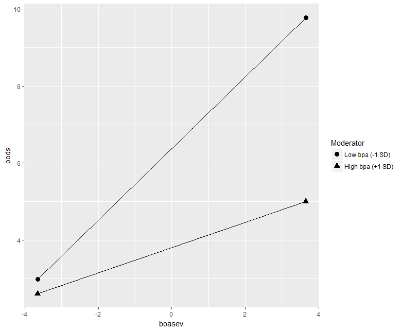
All the examples presume a model with two independent variables in order to facilitate the development of a central concept in interaction analysis. That concept is that regardless of whether the independent variables are both categorical, one categorical and one numeric, or both numeric, the meaning of interaction is the same thing. A 2-way Interaction is always the change of a bivariate relationship across values of a third variable. In traditional ANOVA (analyzing means with two categorical IVs), this is often termed a 'difference in differences'.
Another central theme is the equivalence of the simple main effect concept in traditional ANOVA (two categorical IVs) to the simple slopes concept in moderator analysis with one or two numeric IVs.
Two-IV regression models produce a surface fit that is a plane in models that do not include an interaction term. These are called additive models. When the interaction term is included, the multiplicative model fits a warped plane. The ability of R software to produce 3D scatterplots has facilitated these visualizations.
In addition, the app permits use of the mouse to rotate the 3D scatterplot figures interactively. This provides an enhanced visual understanding of the surfaces and the simple effect locations.
The two-categorical-IVs example is a simulated data set that reduces to the traditional 2x2 ANOVA design.
The one-categorical/one-numeric-IV example is the NHANES data set where systolic blood pressure is the DV and the IVs are smoking status and body weight.
The two-numeric-IVs example is a data set where depression severity is the outcome variable and predictions from an index of anxiety severity and a measure of positive affect are the IVs.
Details on the data sets are found in the ABOUT THE DATA SETS tab.
This app is intended to be a supplement to a monograph on Interaction Analysis by B. Dudek, but can also suffice for standalone purposes.


Regression Models with a Numeric DV and two IV's, either Categorical or Numeric
Two Categorical IVs:
Data were simulated for these illustrations.
The two categorical IVs are both illustrated as having two levels. This makes the illustration a traditional 2x2 ANOVA design. Bar graph depictions with Simple Main Effects illustrated, reinforce this traditional anaylysis perspective.
In each case, sample size per group was esatablished as n=4, and the data were systematically created to produce numerical differences in cell means that are visually simple.
The Regression approach to data analysis of 2x2 designs switches to depiction of the data in a 3D Scatterplot, with regression surfaces included. Visualizing Simple Main Effects on these surfaces is a key goal of this app.
Two 2x2 ANOVA data sets were created for these Two-categorical IV's illustrations:
One had no interaction and therefore an additive regression model is appropriate (fit the two-IV, main effects only, regression plane). The other had an interaction (therrefore, Simple Main Effects differ), and the warped regression surface is depicted. In this latter interaction model, the regression equation had the two main effect coding vectors plus their product term for the interaction.
In depictions of both data sets, the IV's are seen (in the 3D plots), to have been contrast coding vectors (+1, and -1 coefficients for the two levels) for the main effects.
One Categorical IV, one Quantitative IV
Systolic blood pressure was predicted, in a linear regression model, from smoker status and body weight.
These data were taken from the publicly available NHANES data set (https://www.cdc.gov/nchs/nhanes/index.htm)
In order to facilitate the visualizations, a random subsample of the full data set was taken. The outcome of the study in this subset of data may not be identical to the analsyses on the full data set. Therefore, the presentation of the data here should be viewed only in an instructional context for visualizing interaction and simple slopes. Users are advised to NOT draw scientific conclusions from these depictions.
Two Quantitative IVs
The data set used in this set of visualizations has been provided by Professor James Boswell, and is from a psychological treatment study. Baseline indices of Depression severity, Anxiety Severity, and Positive Affect were acquired on a sample of clients prior to treatment. These simple measurements permit investigation of the relative and interactive importance of Anxiety and Positivity in their relationship to Depression scores. It is not surprising that Anxiety Scores and Depression scores are positively related.
The interesting question is whether Postitive Affect moderates this relationship. The analysis presented in these visualizations is superficial and is only intended for instructional purposes in seeing interaction and Simple Slopes. Any strong scientific conclusions based on these depictions would be premature.