Chapter 2 Import data set and do Exploratory Data Analysis
Many applications of repeated measures designs involve simply tracking participant across time and measuring the DV at fixed time points. It is also possible to employ such a design when the IV is a manipulated variable. The levels of the repeated factor thus represent different “treatment” conditions. The primary example data set used here is of this latter type. In such experiments, the order of treatments is often randomized across participants/subjects. The data set used here is a textbook example, taken from the Keppel textbook (Keppel & Wickens, 2004, exercise #1, Ch. 16, pp 366-367).
The study outlined in the exercise presumed to evaluate an appetitive behavior among rats, tongue protrusion (called DV in the data set). Tongue protrusions are also used in social situations, presumably as part of a chemical senses system for evaluating airborne molecules that may carry social significance. Accordingly, a study was designed where rats were exposed to bedding types. Two control types of conditions were employed, clean bedding and bedding from the rat’s own home cage. Three other conditions were bedding from other species, iguana, whiptail lizard, and kangaroo rat. The IV (called “type” in the data frame) thus had five levels, with each of ten subjects being measured under each level, making the study a simple one-factor repeated measures design.
Other data sets are used for explicit purposes in other sections of this document.
2.1 Data Import
Many of the methods for repeated measures analysis require the “long” format data file. This is available as a .csv file and is imported with the code found below. In a separate document/tutorial, the conversion from wide to long format (or vice versa) is illustrated. There are several ways of doing this conversion in R, but at the time of this writing, tidyverse tools are the most convenient. The pivot_longer and pivot_wider functions in the tidyr package are useful ways to execute the conversion, but other methods are also illustrated in the separate tutorial document.
This code imports the primary data file, and the code chunk also designates the “snum” case number variable as a factor since that is required in most of the analyses to follow in later chapters. It is imported as a numeric variable. In addition, the ordering of the “type” levels is changed from the default alphabetical to match prior graphical work with the data set and prior analyses and analyses using contrasts in SPSS.
# read data set - long form exported from SPSS
rpt1.df <- read.csv("data/1facrpt_long.csv", stringsAsFactors=TRUE)
# change the snum variable to a factor variable (was numeric)
rpt1.df$snum <- as.factor(rpt1.df$snum)
# change the order of the factor levels of type to match the
# original order and match our prior SPSS work,
# including setting  up contrasts
rpt1.df$type <- ordered(rpt1.df$type,
                     levels=c("clean","homecage","iguana",
                              "whiptail", "krat"))
# look at a few lines from the data frame
headTail(rpt1.df)
## snum type DV
## 1 1 clean 24
## 2 1 homecage 15
## 3 1 iguana 41
## 4 1 whiptail 30
## ... <NA> <NA> ...
## 47 10 homecage 7
## 48 10 iguana 4
## 49 10 whiptail 7
## 50 10 krat 232.2 Numerical Exploratory Data Analysis
Using describeBy from the psych package, we can now examine a few descriptive statistics for the five conditions. Note that only a subset of the statistics produced by describeBy are requested, and the resultant table is more nicely formatted using gt. The summaries are also split into two tables to control the width of the tables.
d1 <- describeBy(rpt1.df$DV, group=rpt1.df$type,
                 type=2, mat=T)[,c(2,4:9)]
gt(d1)| group1 | n | mean | sd | median | trimmed | mad |
|---|---|---|---|---|---|---|
| clean | 10 | 6.8 | 7.177124 | 6.5 | 5.500 | 5.1891 |
| homecage | 10 | 6.0 | 5.676462 | 5.5 | 5.625 | 6.6717 |
| iguana | 10 | 7.3 | 12.445883 | 3.0 | 4.000 | 4.4478 |
| whiptail | 10 | 9.4 | 8.796464 | 6.5 | 8.000 | 7.4130 |
| krat | 10 | 23.1 | 18.174769 | 16.5 | 22.125 | 10.3782 |
d2 <- describeBy(rpt1.df$DV, group=rpt1.df$type,
                 type=2, mat=T)[,c(2,10:15)]
gt(d2)| group1 | min | max | range | skew | kurtosis | se |
|---|---|---|---|---|---|---|
| clean | 0 | 24 | 24 | 1.5779391 | 3.4183872 | 2.269606 |
| homecage | 0 | 15 | 15 | 0.6150626 | -0.7291575 | 1.795055 |
| iguana | 0 | 41 | 41 | 2.6438283 | 7.4942010 | 3.935734 |
| whiptail | 0 | 30 | 30 | 1.4989085 | 2.7856163 | 2.781686 |
| krat | 0 | 54 | 54 | 0.7791971 | -0.6475045 | 5.747367 |
2.3 Graphical EDA
Simple boxplots are readily obtained wtih this long-format data set. The DV~type model specification is possble because of this long-format data structure, even though the “type” variable is not variable based on different groups of participants.
boxplot(DV~type, data=rpt1.df)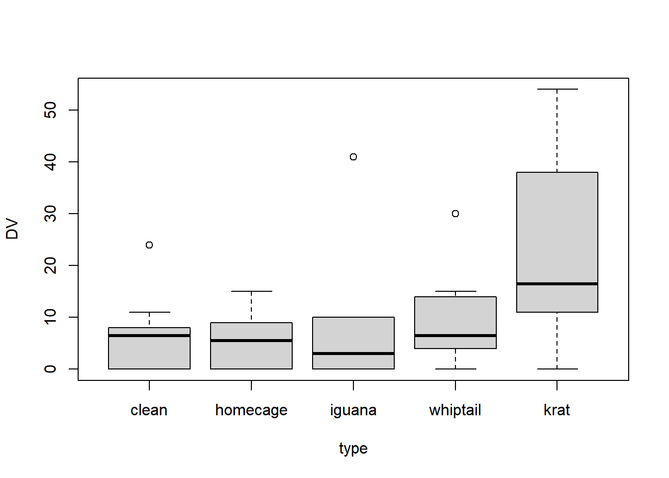
One EDA plot that is often used for repeated measures designs is called a profile plot. It is a simple line graph where each case is represented by one line. This type of plot is argued to enable a visual comparision of the patterns across conditions and the assesment of how consistently the cases show the overall pattern. The negative aspect of the plot is that for a study like this where the IV is categorical, the shape of the lines is actually meaningless. If the repeated measure factor were Time, then such a plot would have greater value. Recall that the placement of the categories along the X axis is actually arbitrary here, so the profiles have no intrinsic meaning - they just permit a comparison of cases to one another. Also, apologies for the non-colorblind friendly palette of colors used for the lines…….. (see a later section of this chapter for a method of control of color palettes in ggplot).
#library(ggplot2)
ggplot(rpt1.df, aes(type, DV, colour=snum)) +
  geom_point(size = 2.5) +
  geom_line(aes(group = snum), linewidth = 1) +
  theme_minimal()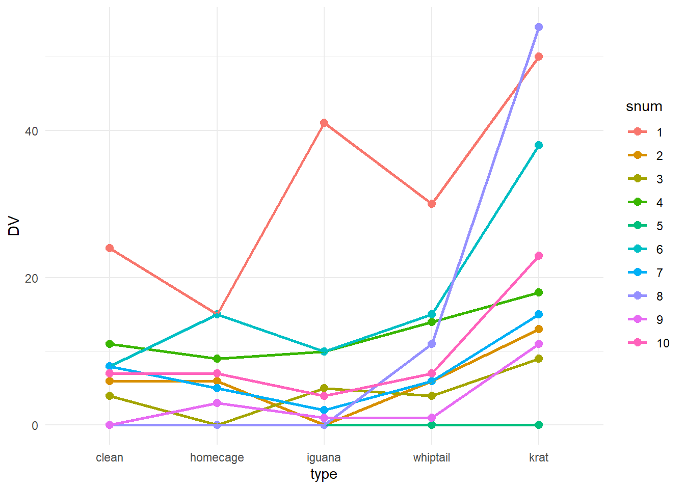
When the repeated factor is categorical rather than quantitative (like time), it is almost expected that the data be summarized graphically with bar graphs plotting the means with error bars (of some sort) added. This plot, also called a dynamite plot, has received considerable criticism as we have discussed. The bargraph.CI function can readily draw such a graph, as easily as we saw it done for between-groups designs - this is enabled because of the long-format structure of the data file.
Note that those std errors of the mean are based on between subject variation and have no specific usage in regard to the omnibus inferential tests performed in chapter 3 and later.
#require(sciplot)
bargraph.CI(rpt1.df$type,rpt1.df$DV,lc=TRUE, uc=TRUE,legend=T,
            cex.leg=1,bty="n",col="gray75",
            ylim=c(0,33),
            xlab="Stimulus Type",
            ylab="Mean DV Score",main="DV by Stimultus type with Std Error Bars",
            cex.names=1.25,cex.lab=1.25)
box()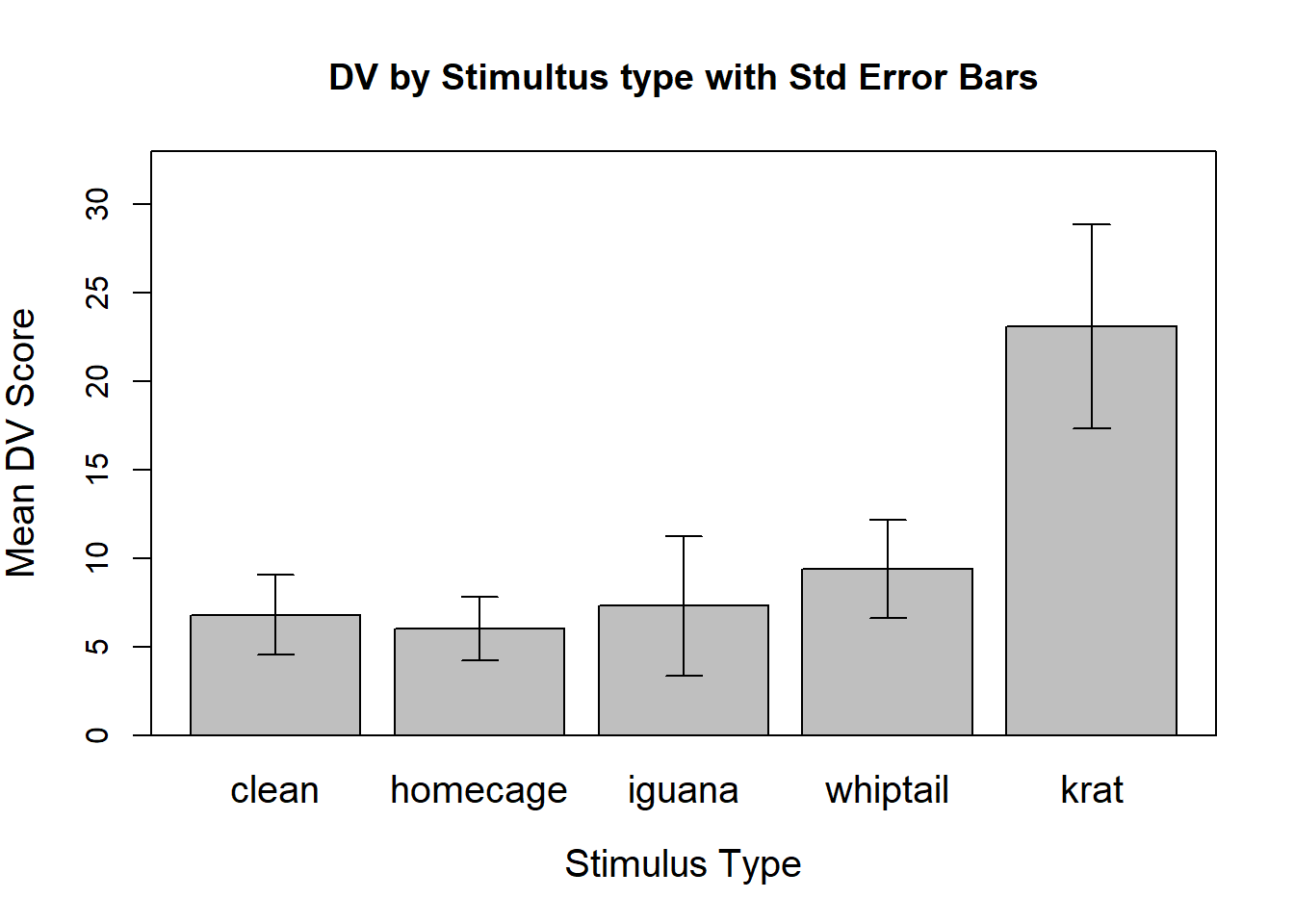
2.4 Graphical EDA with ggplot2: boxplots and bar graphs with error bars
Alternative approaches to boxplots and bar graphs (with error bars) are available with the ggplot2 package. This section also includes demonstration of a violin plot that includes the mean plus error bars. An important section subsequent to this one explores alternative definitions of standard errors for within-subjects (repeated measures) factors.
First I show a ggplot version of the boxplot to reinforce the idea that the ggplot2 package is a useful tool. The core of the plot is drawn with the first two lines of the ggplot function code, and the remainder of the lines of code control stylistic attributes of the plot. A vector of colorblind-friendly color codes is established first and then used for the “fills”. Other commented lines of code show other ways of controlling the color scheme. The reader should note that since the categories are labeled, the use of color here is superfluous and probably should be avoided. It provided an opportunity to illustrate the use of a colorblind friendly palette. See, for example:
- http://mkweb.bcgsc.ca/colorblind/
- http://www.cookbook-r.com/Graphs/Colors_(ggplot2)/#a-colorblind-friendly-palette
# first, establish a colorblind friendly palette
cbPalette <- c("#999999", "#E69F00", "#56B4E9", "#009E73",
               "#F0E442", "#0072B2", "#D55E00", "#CC79A7")
p2<-ggplot(data = rpt1.df, aes(x = type, y = DV, fill=type)) +
  geom_boxplot() +xlab("Stimulus Type") + ylab("DV") +
  scale_fill_manual(values=cbPalette) +
  #scale_fill_brewer(palette="Paired") +
  #scale_colour_grey() + scale_fill_grey() +
  ggtitle("Boxplots of Tongue Protrusions by Stimulus Type") +
  guides(fill=FALSE) + # removes legend
  theme_minimal() +
  theme(plot.title = element_text(size=10,
                                  face = "bold", hjust = .5))
p2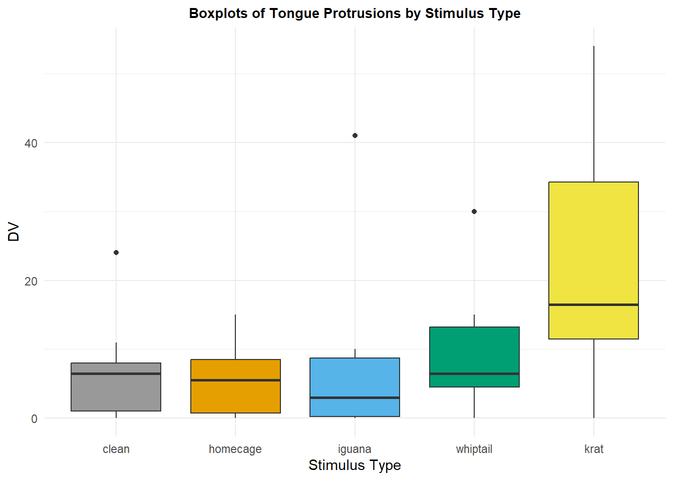
The traditional bar graph to depict means with standard error bars (or CI’s) can also be achieved with ggplot. In order to create this graph, the summary statistics have to be extracted from the data set. Means, standard errors, and CI’s are obtained from long-format data frames with the summarySE function from the Rmisc package. The error bars are then plotted one “se” or one “ci” up and down from the mean. The variable in the summarySE-produced data frame called “DV” is actually the man of the condition. The variable called “ci” is the one-sided distance from the mean to an upper or lower confidence limit (95% here).
rpt1summary.b <- Rmisc::summarySE(rpt1.df,
                                  measurevar="DV",
                                  groupvars="type",
                                  conf.interval=.95)
rpt1summary.b
## type N DV sd se ci
## 1 clean 10 6.8 7.177124 2.269606 5.134205
## 2 homecage 10 6.0 5.676462 1.795055 4.060696
## 3 iguana 10 7.3 12.445883 3.935734 8.903248
## 4 whiptail 10 9.4 8.796464 2.781686 6.292611
## 5 krat 10 23.1 18.174769 5.747367 13.001446The values from this data frame are then used to draw the graph:
p3 <- ggplot(rpt1summary.b, aes(x=type, y=DV, fill=type)) +
  geom_bar(position=position_dodge(), stat="identity", fill="gray") +
  geom_errorbar(aes(ymin=DV-se, ymax=DV+se),
                width=.2,                    # Width of the error bars
                position=position_dodge(.9)) +
  ggtitle("Means plus Between-Subject error bars of Tongue Protrusions by Stimulus Type") +
  guides(fill=FALSE) + # removes legend
  theme_minimal() +
  theme(plot.title = element_text(size=10,
                                  face = "bold", hjust = .5))
p3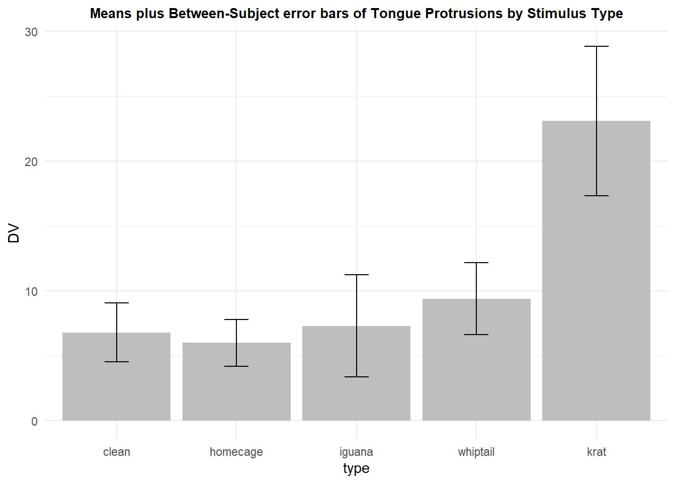
Another possibility is to draw violin plots for each condition and to also display the means and standard errors (or confidence intervals as I did here). Notice that with the floor of zero, one of the CI’s actually extends to a non-sensical value - a frequent occurrence when the distribution is skewed with a mean close to zero. This will be a more helpful plot when sample sizes are larger and the densities are not dominated by small numbers of points in regions of the Y axis DV scale.
p4 <- ggplot(rpt1.df, aes(x=type, y=DV)) +
geom_violin() +
geom_point(aes(y=DV),data=rpt1summary.b, color="black") +
geom_errorbar(aes(y=DV, ymin=DV-ci, ymax=DV+ci),
color="black", width=.05, data=rpt1summary.b)+
ggtitle("Violin plots with means plus between-Subject 95% CI's") +
guides(fill=FALSE) + # removes legend
theme_minimal() +
theme(plot.title = element_text(size=10,
face = "bold", hjust = .5))
p4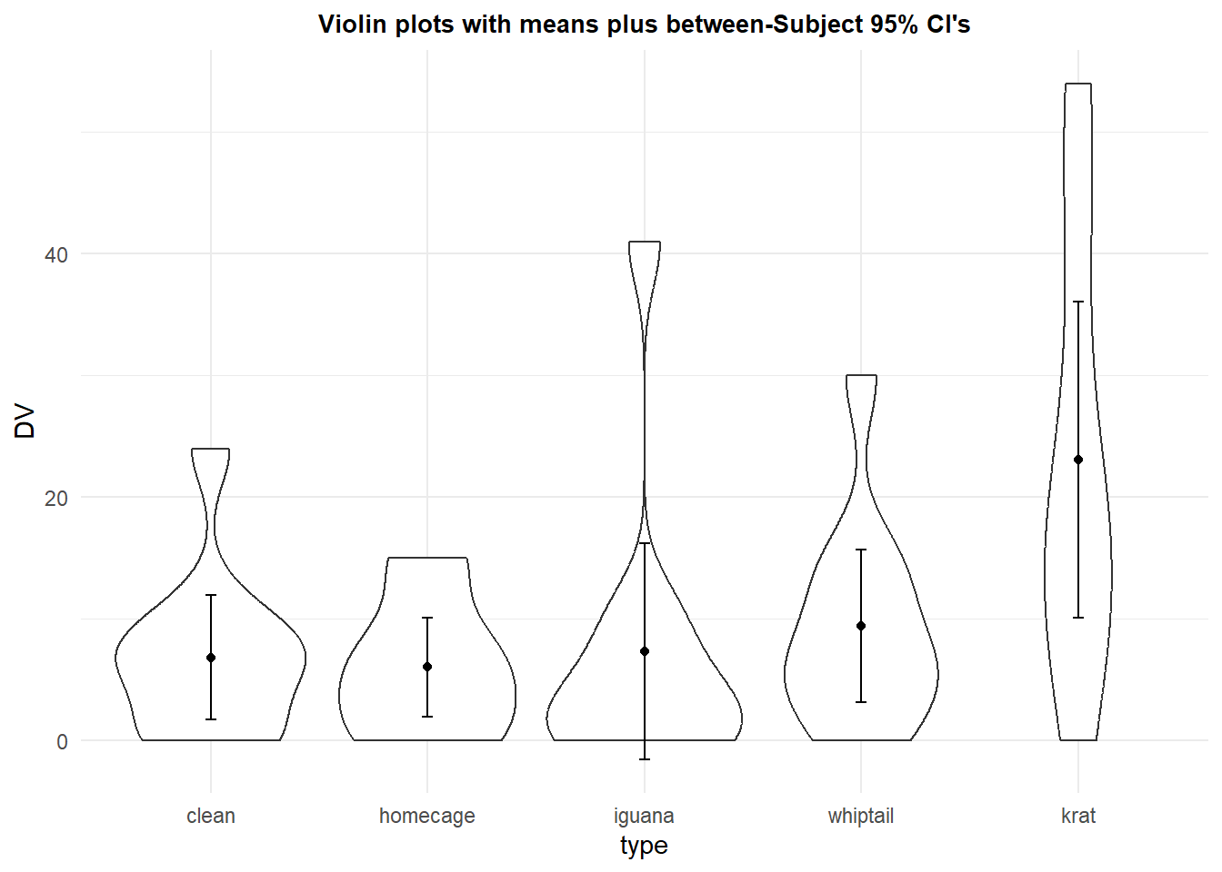 Showing the raw data is always a good thing. The profile plot above shows this, but here we see how to create a traditional bar chart of the means with raw data points added.
p4b <- ggplot(rpt1summary.b, aes(x=type, y=DV)) +
  geom_bar(position=position_dodge(), stat="identity", fill="gray") +
  geom_point(aes(y=DV, x=type), data=rpt1.df,color="black", size=2) +
  ggtitle("Means plus raw data points, by condition") +
  guides(fill=FALSE) + # removes legend
  theme_minimal() +
  theme(plot.title = element_text(size=10,
                                  face = "bold", hjust = .5))
p4b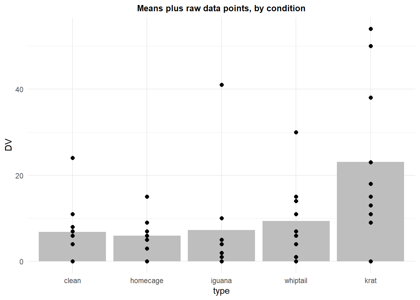
2.5 What are the proper error bars for a plot of a within-subjects design?
There is a literature concerning the correct choice for error bars to display in the kinds of plots shown above with repeated measures designs. The issues are twofold and relate to the origin of the reason for displaying error bars. First, what is the purpose of displaying error bars? Sometimes they are employed simply to show an index of dispersion with a group, or within a condition as is the case for a repeated measures factor level. Error bars that are standard deviations can accomplish this, but showing the raw data as we saw above is also a good choice. At other times error bars are employed to provide a method of “inference by eye” (Cumming & Finch, 2005) by visualization of the degree of overlap of error bars, confidence intervals and means.
In the plots drawn above, depicting means plus/minus error bars or confidence intervals, the “error” is derived from the “subject” variation at each level of the repeated factor (each condition). However, this is not the error that is related to any of the inferences done regarding variation in means in such designs. In fact, the whole purpose of the repeated measures design is to treat it as a randomized block design where the main effect of “subject”, or case, is pulled out of the analytical system and the remaining error that is used is the condition by subject interaction (the “Axs” term). So, the standard errors used above are not helpful because they come from a mix of the main effect of subject and the condition by subject interaction term - think of subject variation at a level of the repeated factor as a simple main effect. The sum of the variation of that set of simple main effects would comprise a pooling of the main effect of subject and the interaction term. If a descriptive measure of dispersion is desired, then simple standard deviations might be displayed or better yet, the raw data points. But if a connection to inferential analyses performed on the data set is the goal, then a different kind of error bar should be used - one that relates to the Axs interaction term.
A literature dating back to Tukey has argued for the ability to do “inference by eye” in order to decide whether two levels of a factor are “significantly” different. Cumming and Finch (2005) gave specific guidance about the deviation between means of two conditions relative to std errors or CI’s in order to “see” that two means would be “significantly” different. For standard errors plotted on means in bar graphs, the two means would have to be approximately 3 std errors apart to reach significance at the nominal .05 level. This is the Cumming and Finch “Rule 7). CI overlap would be approximately 50% for the same conclusion. But this presumes that the”correct” std error is used (and employed in the construction of a confidence interval).
2.5.1 The method of Loftus and Masson (1994)
Several decades ago, I began using what I called “generalized standard errors” for plotting purposes in depiction of means from ANOVA designs (e.g., (Phillips & Dudek, 1989)). The idea was to generate a standard error of the mean using the appropriate error term (actually the square root of that MS) and divide by the square root of the appropriate N. This would give a standard error depiction that reflected the error that was actually used in the inferences done with ANVOA methods, rather than the collection of individual group or condition standard errors such as those depicted above. Over a decade later, Loftus and Masson (1994) published an article essentially arguing the same thing. The article laid out the idea that for repeated measures designs, the ANOVA error term (for the omnibus F test) in a 1-factor design is the condition by subject interaction term (Axs in the randomized block notation). The square root of this MS, divided by the square root of N would be a more appropriate standard error to use for error bars in bar graphs of condition means - and each condition would have this same standard error placed on the point/bar on the plot.
It is fairly simple to construct such a standard error once the ANOVA is complete. This basic one factor repeated measures ANOVA is explored in detail in the next chapter, but the analysis is accomplished here in order to find the MS(Axs) term.
contrasts(rpt1.df$type) <- contr.sum
fitplot <- aov(DV ~ type + Error(snum/type),data=rpt1.df)
summary(fitplot)
##
## Error: snum
## Df Sum Sq Mean Sq F value Pr(>F)
## Residuals 9 3740 415.5
##
## Error: snum:type
## Df Sum Sq Mean Sq F value Pr(>F)
## type 4 2042 510.4 8.845 4.42e-05 ***
## Residuals 36 2077 57.7
## ---
## Signif. codes: 0 '***' 0.001 '**' 0.01 '*' 0.05 '.' 0.1 ' ' 1The standard error can be manually created from the MS error term (Axs) found in the summary table.
wstderr <- (57.7^.5)/(10^.5)We can use the same summary data frame as above in order to extract the means from the data set, and employ the manually created standard error value to draw error bars (+/- 1 std error) on the bars. The same std error is used for each condition in this plot.
p5 <- ggplot(rpt1summary.b, aes(x=type, y=DV, fill=type)) +
  geom_bar(position=position_dodge(), stat="identity", fill="gray") +
  geom_errorbar(aes(ymin=DV-wstderr, ymax=DV+wstderr),
                width=.2,                    # Width of the error bars
                position=position_dodge(.9)) +
  ggtitle("Error bars from Generalized std error using ANOVA Axs error term") +
  guides(fill=FALSE) + # removes legend
  theme_minimal() +
  theme(plot.title = element_text(size=10,
                                  face = "bold", hjust = .5))
p5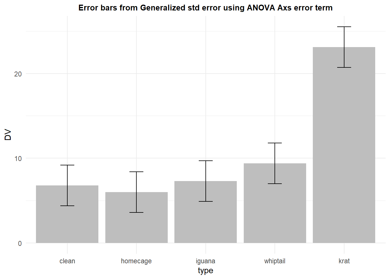
This generalized standard error has the advantage of being the actually error variance that is used in the analysis, albeit for the omnibus F test. It is, however, burdened by the same sphericity assumption that we will see can handicap its use in that omnibus ANOVA - covered in later chapters.
2.5.2 Alternatives to the Loftus and Masson approach
The Loftus and Masson approach received some criticism (Bakeman & McArthur, 1996; Morrison & Weaver, 1995) as being too difficult to execute and perhaps not exactly what was needed (I have found that criticism to be shallow). An alternative was proposed by Cousineau (2005). This idea was a method to remove the between subject variation from the error term with a “normalization” procedure. The approach centered the data for each subject/case around its own aggregate mean. Thus with this method, each case would have the same mean, although still varying across the repeated measure factor. The remaining variation of data points at each level of the repeated factor would reflect the components of the Axs interaction. Morey(2008) pointed out a flaw in the “normalization” method and presented a corrected version. This corrected std error or CI is provided by the summarySEwithin function in the Rmisc package and that is what is implemented here, first with the creation of the summary data frame.
rpt1summary.w <- Rmisc::summarySEwithin(rpt1.df,
                                  measurevar="DV",
                                  withinvars="type",
                                  idvar="snum")
rpt1summary.w
## type N DV sd se ci
## 1 clean 10 6.8 5.258010 1.6627287 3.761354
## 2 homecage 10 6.0 6.467182 2.0451026 4.626343
## 3 iguana 10 7.3 6.518734 2.0614046 4.663221
## 4 whiptail 10 9.4 1.495177 0.4728166 1.069586
## 5 krat 10 23.1 13.202883 4.1751181 9.444773Now the graph can be redrawn using these “normalized” standard errors or “normalized” confidenc intervals. This plot uses the standard errors:
p6 <- ggplot(rpt1summary.w, aes(x=type, y=DV, fill=type)) +
  geom_bar(position=position_dodge(), stat="identity", fill="gray") +
  geom_errorbar(aes(ymin=DV-se, ymax=DV+se),
                width=.2,                    # Width of the error bars
                position=position_dodge(.9)) +
  ggtitle("Means plus Within-Subject error bars of Tongue Protrusions by Stimulus Type") +
  guides(fill=FALSE) + # removes legend
  theme_minimal() +
  theme(plot.title = element_text(size=10,
                                  face = "bold", hjust = .5))
p6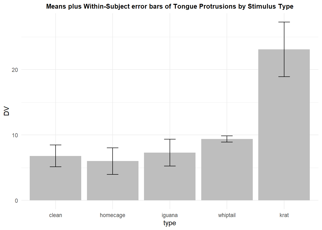
In order to compare, we can add both the between subjects error bar that was used initially and this “normalized” approach on the same plot. It is clear that the corrected standard error will, appropriately, be smaller.
p7 <- ggplot(rpt1summary.w, aes(x=type, y=DV, fill=type)) +
  geom_bar(position=position_dodge(), stat="identity", fill="gray") +
  geom_errorbar(aes(ymin=DV-se, ymax=DV+se), data=rpt1summary.b,
                width=.2,                    # Width of the error bars
                position=position_dodge(.9),
                colour="red") +
  geom_errorbar(aes(ymin=DV-se, ymax=DV+se),
                width=.2,                    # Width of the error bars
                position=position_dodge(.9)) +

  ggtitle("Means plus two types of error bars: between (red); within (black)") +
  guides(fill=FALSE) + # removes legend
  theme_minimal() +
  theme(plot.title = element_text(size=10,
                                  face = "bold", hjust = .5))
p7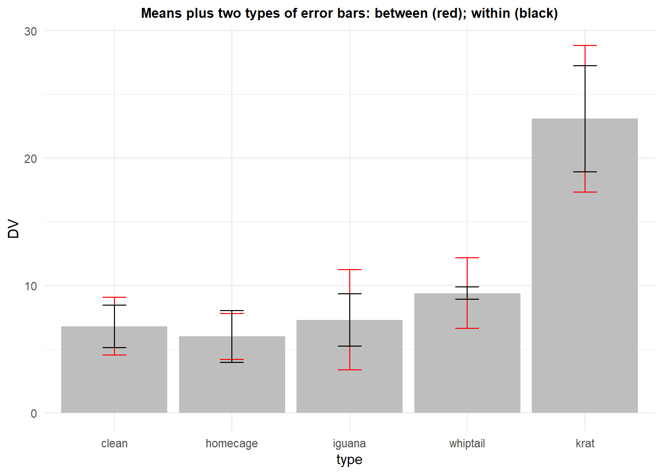
We can also redraw the violin plot redone with CI’s based on the within-subject std error:
p8 <- ggplot(rpt1.df, aes(x=type, y=DV)) +
  geom_violin() +
  geom_point(aes(y=DV),data=rpt1summary.w, color="black") +
  geom_errorbar(aes(y=DV, ymin=DV-ci, ymax=DV+ci),
                color="black", width=.05, data=rpt1summary.w)+
  ggtitle("Violin plots with means plus Within-Subject 95% CI's") +
  guides(fill=FALSE) + # removes legend
  theme_minimal() +
  theme(plot.title = element_text(size=10,
                                  face = "bold", hjust = .5))
p8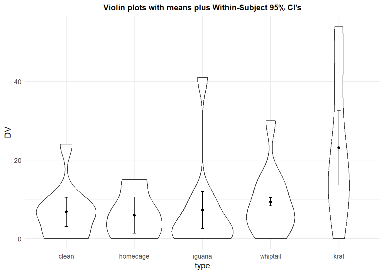
The Cousineau/Morey method seems to be an improvement on the traditional “between subjects” standard error initially outlined above, but it too can be criticized. Those individual standard errors are not used anywhere in the analysis, so it is not clear how meaningful they are. If they are to assist in “inference by eye”, then they should relate to comparisons between means of different conditions. They are not directly related to inferences about such comparisons.
2.5.3 Franz and Loftus 2012 approach for pairwise comparisons
Franz and Loftus (2012) argued that “normalization method leads to biased results and is uninformative with regard to circularity.” They made the simple point that if the desire is to visually compare pairs of means from different conditions, then the error bars should reflect those pairwise comparisions. And, comparison of pairs of repeated measure levels is tantamount to performing a dependent samples t-test. So their direct solution is to depict the mean differences between pairs and use the standard error that is created to perform each of the different paired t-tests. In the next section, we will couch this perspective as a narrowly defined se of analytical contrasts, but for now, it makes considerable sense.
In order to examine the pairwise comparisons, the first step (as in the dependent samples t-test) is to create difference scores for each subject/case for each pair of levels. In the example we are working with here, with five levels of the repeated measure factor, this produces ten pairs and thus ten new variables. Rather than labor to obtain those paired difference variables in R with the long-format data set, I created the ten new variables beginning with a wide format version of the data file, in Excel, and then saved it to a .csv file.
pairdiffs <- read.csv("data/1facrpt_with_diffs.csv")
pairdiffs
## snum diff2.1 diff3.1 diff4.1 diff5.1 diff3.2 diff4.2 diff5.2 diff4.3 diff5.3
## 1 1 -9 17 6 26 26 15 35 -11 9
## 2 2 0 -6 0 7 -6 0 7 6 13
## 3 3 -4 1 0 5 5 4 9 -1 4
## 4 4 -2 -1 3 7 1 5 9 4 8
## 5 5 0 0 0 0 0 0 0 0 0
## 6 6 7 2 7 30 -5 0 23 5 28
## 7 7 -3 -6 -2 7 -3 1 10 4 13
## 8 8 0 0 11 54 0 11 54 11 54
## 9 9 3 1 1 11 -2 -2 8 0 10
## 10 10 0 -3 0 16 -3 0 16 3 19
## diff5.4
## 1 20
## 2 7
## 3 5
## 4 4
## 5 0
## 6 23
## 7 9
## 8 43
## 9 10
## 10 16But in order to use ggplot and the summary functions to draw the plot, we need to convert this wide data frame to a long version, using tools from tidyr. The pivot_longer function makes this simple. The 10x10 data matrix is now a 100 x 1 data matrix and the data frame has id variables for subject number and pair identity.
pairs_long <-
  tidyr::pivot_longer(data=pairdiffs,
                      cols=2:11,
                      names_to="pair",
                      values_to="DV")
pairs_long$pair <- as.factor(pairs_long$pair)
pairs_long
## # A tibble: 100 × 3
## snum pair DV
## <int> <fct> <int>
## 1 1 diff2.1 -9
## 2 1 diff3.1 17
## 3 1 diff4.1 6
## 4 1 diff5.1 26
## 5 1 diff3.2 26
## 6 1 diff4.2 15
## 7 1 diff5.2 35
## 8 1 diff4.3 -11
## 9 1 diff5.3 9
## 10 1 diff5.4 20
## # … with 90 more rowsAt this point, we need to compute the traditional standard error for each of the ten variables since that is the standard error used in the paired t-tests. The summarySE function from Rmisc accomplishes this as we saw with the “between subjects” standard errors computed several sections above. Note that division of the mean (called DV in this data frame) by the “se” yields the t value if that particular pair were examined with a dependent samples t-test (see a later chapter).
# treat as BG for different variables (ten of them)
pairs_summary <- Rmisc::summarySE(pairs_long,
                                        measurevar="DV",
                                        groupvars="pair")

pairs_summary
## pair N DV sd se ci
## 1 diff2.1 10 -0.8 4.237400 1.339983 3.031253
## 2 diff3.1 10 0.5 6.450667 2.039880 4.614530
## 3 diff3.2 10 1.3 9.238206 2.921377 6.608614
## 4 diff4.1 10 2.6 4.115013 1.301281 2.943703
## 5 diff4.2 10 3.4 5.541761 1.752459 3.964337
## 6 diff4.3 10 2.1 5.782156 1.828478 4.136306
## 7 diff5.1 10 16.3 16.275749 5.146844 11.642969
## 8 diff5.2 10 17.1 16.251154 5.139066 11.625375
## 9 diff5.3 10 15.8 15.504838 4.903060 11.091493
## 10 diff5.4 10 13.7 12.596737 3.983438 9.011163Now we can draw a plot that produces the ten means of the paired difference score variables. The t-test of each of these paired differences is compared to a null hypothesis value of zero, so our “inference by eye” approach would ask whether the CI derived from these standard errors overlaps the null value of zero. This plot depicts the means with 95% CI’s. We conclude that condition 5 (kangaroo rat) is significantly different from each of the other four conditions.
The main value of taking this paired approach is that (1) the errors associated with each pair are specific to that comparison and (2) not burdened by the sphericity assumption.
A downside of this method is that as implemented, it does not take into account the accumulated error problem of the multiple simultaneous tests, most of which are probably not a priori hypotheses. Fortunately, the CI could be adjusted with one of the many bonferroni/holm/FDR methods available.
With this kind of plot, the visual purpose is to compare each mean to the null hypothesis value of zero, rather than to each other.
p9 <- ggplot(pairs_summary, aes(x=pair, y=DV, fill=pair)) +
  geom_bar(position=position_dodge(), stat="identity", fill="gray") +
  geom_errorbar(aes(ymin=DV-ci, ymax=DV+ci), data=pairs_summary,
                width=.2,                    # Width of the error bars
                position=position_dodge(.9)) +
  ggtitle("Means plus std errors for pairwise differences") +
  guides(fill=FALSE) + # removes legend
  theme_minimal() +
  theme(plot.title = element_text(size=10,
                                  face = "bold", hjust = .5))
p9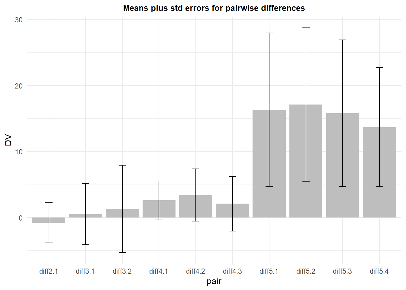
2.6 Conclusions on error bars and plotting graphs and specific errors for analytical/orthogonal contrasts
It strikes me that all of this discussion is obviated if the goal of the analysis is hypothesis driven inference. The method of choice for evaluating specific hypotheses is the use of analytical contrasts. These contrasts are conceptual extensions of the paired t-test approach, but are more elegant. They will be considered in a later chapter of this tutorial, and plots analogous to the paired difference plot just shown will be created then. That approach can also be couched in terms of orthogonal sets which may be desireable when concerns about alpha rate inflation exist.