Chapter 9 Trend Analysis and A Pre-Post Design
This chapter utilizes two different data sets than the core one used in prior chapter. There are three goals. First is to review and extend some of the core analyses found in prior chapters. The second is to implement orthogonal trend analysis in a design where the repeated factor is a quantitative variable (time). The third is to approach a commonly used design, the pre-post design and emphasize the use of analytical and orthogonal contrasts to approach the primary questions posed by such a design. These analyses will confront the issue of appropriate choice of error terms for contrasts as seen in earlier chapters with recommended approaches.
9.1 Trend Analysis
This illustration uses a data set from the Maxwell, Delaney and Kelley (2017) textbook on experimental design and analysis. It is a hypothetical data set where a set of twelve children had been measured at each of four ages. The dependent variable is an age-normed score of a general cogntive test, the “McCarthy Scale of Children’s Ability”. As a one factor repeated measure design, the traditional method views the study as a factorial of the two variables, Age and Subject. The four ages are 30, 36, 42 and 48 months and thus represent points on a continuum. This means that the IV levels can be viewed as a representing points on a quantitative scale, and trend analysis is appropriate. An apriori hypothesis might predict that children’s cognitive abilities are growing rapidly and largely linearly at these ages. But the shape of the curve might have a bend, reflecting a quadratic component. This design can also be viewed through the lens of a longitudinal growth curve design where linear mixed modeling would be appropriate. But since there are no missing data and all subjects were measured at the same time, we will illustrate the traditional “univariate ANOVA” approach here.
9.1.1 Import the data and perform EDA.
The data file are imported as a long-format .csv file where the McCarthy Scale score is called DV and the IV is called age. There is also a “subject” number variable.
mdklong <- read.csv("data/maxwell_tab11_5long.csv", stringsAsFactors=TRUE)
headTail(mdklong)
## subject age DV
## 1 1 thirty_months 108
## 2 1 thirtysix_months 96
## 3 1 fortytwo_months 110
## 4 1 fortyeight_months 122
## ... ... <NA> ...
## 45 12 thirty_months 113
## 46 12 thirtysix_months 117
## 47 12 fortytwo_months 132
## 48 12 fortyeight_months 130Three preparatory steps are needed. First, we convert the numeric type variable, subject, to a factor. Then the levels of the IV (age) are placed in the correct order since as character variable, the default would be to order them alphabetically. Finally, a new numeric variable is created, reflecting the actual months of age of the measurement - four levels, equally spaced. The last step is required for drawing line graphs depicting the age growth curve, even though using age as a factor is how the analytical methods proceed.
mdklong$subject <- as.factor(mdklong$subject)
mdklong$age <- ordered(mdklong$age,
                       levels=c("thirty_months", "thirtysix_months",
                                "fortytwo_months", "fortyeight_months"))
mdklong$agenumeric <- dplyr::recode(mdklong$age,
                                    "thirty_months" = 30,
                                    "thirtysix_months" = 36,
                                    "fortytwo_months"  = 42,
                                    "fortyeight_months" = 48)
headTail(mdklong)
## subject age DV agenumeric
## 1 1 thirty_months 108 30
## 2 1 thirtysix_months 96 36
## 3 1 fortytwo_months 110 42
## 4 1 fortyeight_months 122 48
## ... <NA> <NA> ... ...
## 45 12 thirty_months 113 30
## 46 12 thirtysix_months 117 36
## 47 12 fortytwo_months 132 42
## 48 12 fortyeight_months 130 48In preparation for using ggplot2 for graphing, we derive some summary statistics u sing the Rmisc::summarySE function. The mean of each category is under the column labeled “DV”.
summary.mdk.b <- Rmisc::summarySE(mdklong,
                                  measurevar="DV",
                                  groupvars="agenumeric",
                                  conf.interval=.95)
summary.mdk.b
## agenumeric N DV sd se ci
## 1 30 12 103 13.71131 3.958114 8.711750
## 2 36 12 107 14.16141 4.088046 8.997729
## 3 42 12 110 13.34166 3.851407 8.476889
## 4 48 12 112 14.76482 4.262237 9.381121An initial graph plots the means of the four ages and also shows the raw data points. The means do depict a largely linear increase in scores, but analysis of that linearity will evaluate whether it is large, relative to sampling noise, when the inferential tests are done.
p1 <- ggplot(data=summary.mdk.b, aes(x=agenumeric, y=DV)) +
  geom_line()+
  geom_point(data=mdklong, aes(x=agenumeric, y=DV)) +
  geom_point(color="blue", size=4) +
  scale_x_continuous(breaks=seq(30,50,6))+
  xlab("Age (months)") +
  ylab("McCarthy Scale Score")+
  ggtitle("Mean Scores as a function of Age Plus Raw Data Points")+
  theme_minimal() +
  theme(plot.title = element_text(size=10,
                                  face = "bold", hjust = .5))
p1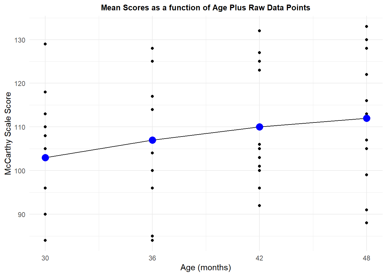
Although the first graph showed the raw data points, it does not permit visualization of the pattern of change across age for each subject. We naturally wonder how consistently subjects show this linear increasing trend that is seen with the means. A profile plot provides this information. Although most subjects tend to increase scores across age, not all do, and there is some inconsistency in the pattern of increase - different shapes. This latter inconsistency in linearity is why a specific error term to test each trend component is useful/important as we will see below.
p2 <- ggplot(mdklong, aes(age, DV, colour=subject)) +
  geom_point(size = 2.5) +
  geom_line(aes(group = subject), size = 1) +
  xlab("Age") +
  ylab("McCarthy Scale Score") +
  scale_colour_grey() +
  ggtitle("Profile Plot of Score by Subject") +
  theme_minimal() +
  theme(legend.position = "none") + # removes legend
  theme(plot.title = element_text(size=10,
                                  face = "bold", hjust = .5))
p2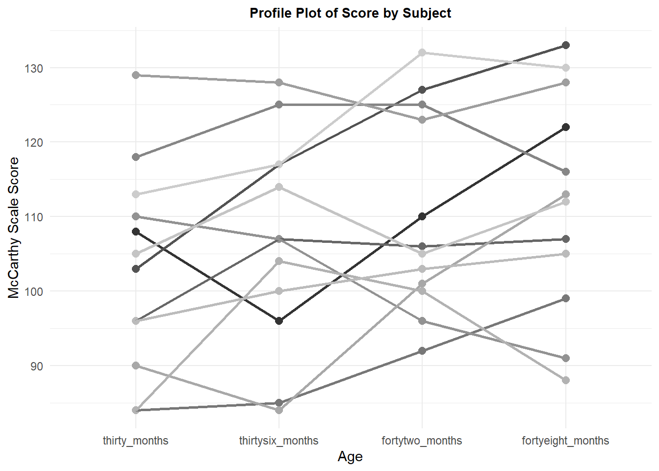
9.1.2 The omnibus analysis for the McCarthy Scale by Age dataset
The omnibus ANOVA is most efficiently accomplished with the aov_car function from the afex package. This code chunk requests that analysis plus the Greenhouse-Geisser correction for non-sphericity. First, it is useful to recall that setting the contrasts for the IV to “sum to zero” contrasts (effect coding) is desireable for these repeated measure designs, although later we will change the contrasts to orthogonal polynomial (trend) contrasts which are also a type of “sum to zero” contrast.
Use of the summary function on the aov_car object produces the ominbus F test (uncorrected), which is significant here. The Mauchley sphericity test is also provided and it is significant with an epsilon value a good bit below 1.0, so we are concerned about use of the omnibus Axs error term in this analysis. The corrected F tests using both the GG and Huynh-Feldt corrections are not significant. This is not necessarily a problem since the primary “a priori” hypothesis was for a linear increase and the test of that is more interesting than the test of the omnibus null hypothesis.
contrasts(mdklong$age) <- contr.sum
fit1.mdk <- aov_car(DV ~ age + Error(subject/age), data=mdklong,
                    anova_table = list(correction = "GG", es="ges"))
summary(fit1.mdk)
##
## Univariate Type III Repeated-Measures ANOVA Assuming Sphericity
##
## Sum Sq num Df Error SS den Df F value Pr(>F)
## (Intercept) 559872 1 6624 11 929.7391 5.586e-12 ***
## age 552 3 2006 33 3.0269 0.04322 *
## ---
## Signif. codes: 0 '***' 0.001 '**' 0.01 '*' 0.05 '.' 0.1 ' ' 1
##
##
## Mauchly Tests for Sphericity
##
## Test statistic p-value
## age 0.24265 0.017718
##
##
## Greenhouse-Geisser and Huynh-Feldt Corrections
## for Departure from Sphericity
##
## GG eps Pr(>F[GG])
## age 0.60954 0.07479 .
## ---
## Signif. codes: 0 '***' 0.001 '**' 0.01 '*' 0.05 '.' 0.1 ' ' 1
##
## HF eps Pr(>F[HF])
## age 0.7248502 0.06353773A quick way of obtaining a corrected F test plus the generalized effect size statistics is just to ask for the contents of the fit1.mdk object.
fit1.mdk## Anova Table (Type 3 tests)
##
## Response: DV
## Effect df MSE F ges p.value
## 1 age 1.83, 20.11 99.73 3.03 + .060 .075
## ---
## Signif. codes: 0 '***' 0.001 '**' 0.01 '*' 0.05 '+' 0.1 ' ' 1
##
## Sphericity correction method: GG9.1.3 Implementing Orthogonal Polynomial Trend Analysis
Trend analysis is begun by specifying the polynomial contrast set for the IV factor. I included the exact values of the IV levels (with the “scores” argument), although it was not necessary here because the default is to assume equal spacing of the IV levels, which we have. Notice the fractional values of the contrast coefficients. These have been orthonormalized. Note that the IV that is used is the age factor which does not have numeric values. The exact numeric values of the age levels are indicated with the “scores” argument.
contrasts(mdklong$age) <- contr.poly(4,scores=(c(30,36,42,48)))
contrasts(mdklong$age)
## .L .Q .C
## thirty_months -0.6708204 0.5 -0.2236068
## thirtysix_months -0.2236068 -0.5 0.6708204
## fortytwo_months 0.2236068 -0.5 -0.6708204
## fortyeight_months 0.6708204 0.5 0.2236068We can check to see that the contrasts are orthonormalized with simple functions since the contrasts are a matrix. First we square the values and the sum the columns of the matrix to see that they do, in fact, sum to 1.0.
colSums(contrasts(mdklong$age)^2)## .L .Q .C
## 1 1 1If the IV levels had been unequally spaced, the contrast function could handle that by specifying the values of the levels with the “scores” argument. For example, if the levels were 30, 36, 45, and 60 months, the code would be this:
# code chunk not run
#contrasts(mdklong$age) <- contr.poly(4,scores=(c(30,36,45,60)))
#contrasts(mdklong$age)
One way of testing each of the contrasts is to use the “split” argument on the summary function where the ANOVA object is produced by the aov function. Note that the “residuals” term is the MS Axs residual from the omnibus ANOVA. This is the flawed error term that should not be used if there is non-sphericity. Unfortunately the first summary table here does not show that MS Axs term and it is easy to assume that the error term labled “Residuals” is what was used in the denominator of the F values. Some quick arithmetic can verify that (e.g., 540.0/602.2 does not equal the F value of 8.883 for the linear term). Use of the summary function without the “split” argument in the succeeding code chunk reveals that the MS Axs value of 60.79, with its 33 df, is the denominator of all three of the contrast F values in this “split” table. Since this data set appeared to have some clear degree of non-sphericity, the omnibus error term should be avoided in favor of specific error terms for each contrast.
fit2.mdk <- aov(DV ~ age + Error(subject/age), data=mdklong)
summary(fit2.mdk, split=list(age=list(linear=1, quadratic=2, cubic3=3)))
##
## Error: subject
## Df Sum Sq Mean Sq F value Pr(>F)
## Residuals 11 6624 602.2
##
## Error: subject:age
## Df Sum Sq Mean Sq F value Pr(>F)
## age 3 552 184.0 3.027 0.04322 *
## age: linear 1 540 540.0 8.883 0.00537 **
## age: quadratic 1 12 12.0 0.197 0.65972
## age: cubic3 1 0 0.0 0.000 1.00000
## Residuals 33 2006 60.8
## ---
## Signif. codes: 0 '***' 0.001 '**' 0.01 '*' 0.05 '.' 0.1 ' ' 1summary(fit2.mdk)##
## Error: subject
## Df Sum Sq Mean Sq F value Pr(>F)
## Residuals 11 6624 602.2
##
## Error: subject:age
## Df Sum Sq Mean Sq F value Pr(>F)
## age 3 552 184.00 3.027 0.0432 *
## Residuals 33 2006 60.79
## ---
## Signif. codes: 0 '***' 0.001 '**' 0.01 '*' 0.05 '.' 0.1 ' ' 19.1.4 Specific error terms for the Trend contrasts
Earlier in this document, in chapters 3 and 4, we saw the difficulty of finding a way to obtain specific error terms. for example Alinear x subject. Since we need them for this trend analysis, we can take the approach of creating new variables for each trend component by applying the trend coefficients to the data for each subject, individually. This method creates three new variables (linear, quadratic, and cubic) and values of them for each subject, which are then each submitted to a one-sample t-test against a null hypothesis of zero. A plot can also be drawn.
The approach uses a wide form of the data set and then converts the DV data to a matrix so that matrix multiplication methods can be applied.
mdkwide <- read.csv("data/maxwell_tab11_5wide.csv")
headTail(mdkwide)
## subject thirty_months thirtysix_months fortytwo_months fortyeight_months
## 1 1 108 96 110 122
## 2 2 103 117 127 133
## 3 3 96 107 106 107
## 4 4 84 85 92 99
## ... ... ... ... ... ...
## 9 9 84 104 100 88
## 10 10 96 100 103 105
## 11 11 105 114 105 112
## 12 12 113 117 132 130mwide <- as.matrix(mdkwide[, 2:5]) # only uses the DV variables, leaving subject out
headTail(mwide)## thirty_months thirtysix_months fortytwo_months fortyeight_months
## 1 108 96 110 122
## 2 103 117 127 133
## 3 96 107 106 107
## 4 84 85 92 99
## ... ... ... ... ...
## 9 84 104 100 88
## 10 96 100 103 105
## 11 105 114 105 112
## 12 113 117 132 130Now the data set is a 12x4 matrix. The contrasts matrix used above is a 4x3 matrix. If we post-multitply the data matrix by the coefficients matrix, the product will contain three new variables that are the creation of the trend component value for each subject. To reiterate, the contrast coefficients are applied to data points from each case individually, rather than to condition means. The inferential result will be the same, but this is a direct method of obtaining error terms specific to each contrast.
trendmat <- mwide%*%contrasts(mdklong$age)
trendmat
## .L .Q .C
## [1,] 12.521981 12 -6.260990e+00
## [2,] 22.360680 -4 0.000000e+00
## [3,] 7.155418 -5 3.130495e+00
## [4,] 11.627553 3 -1.341641e+00
## [5,] -1.341641 -8 -4.472136e-01
## [6,] -15.205262 -1 3.130495e+00
## [7,] -1.788854 3 3.130495e+00
## [8,] 19.230185 9 -6.260990e+00
## [9,] 1.788854 -16 3.577709e+00
## [10,] 6.708204 -1 -3.552714e-15
## [11,] 2.683282 -1 7.602631e+00
## [12,] 14.758049 -3 -6.260990e+00Next we return the trend contrast matrix to the form a data frame and change the column/variable names to make the labeling more clear.
trendcontrasts <- as.data.frame(trendmat)
colnames(trendcontrasts) <- c("linear", "quadratic", "cubic")
headTail(trendcontrasts)
## linear quadratic cubic
## 1 12.52 12 -6.26
## 2 22.36 -4 0
## 3 7.16 -5 3.13
## 4 11.63 3 -1.34
## ... ... ... ...
## 9 1.79 -16 3.58
## 10 6.71 -1 0
## 11 2.68 -1 7.6
## 12 14.76 -3 -6.26At this point, we can test each variable with a one-sample t-test. The squares of these t values would be identical to F tests if the contrasts were done with software that provides the hypothesis and specific error terms more directly (e.g., SPSS GLM or MANOVA). The “error term” here with these t-tests is specific because it is the variation of the contrast across the 12 subjects, thus it is a contrast x subject interaction term with the proper 11 df. It is just couched as a standard error of the mean in the production of the t value.
It is interesting that by using the specific error term approach, one of the contrasts is significant, even though the corrected omnibus F test for the age factor was not. This can easily happen with contrast partitioning when one contrast absorbs most of the effect of the condition into its single df rather than having it “diluted” by the 3 df omnibus term. And, since the error is “specific” it needs no correction for non-sphericity.
t.test(trendcontrasts$linear,mu=0)##
## One Sample t-test
##
## data: trendcontrasts$linear
## t = 2.2414, df = 11, p-value = 0.04659
## alternative hypothesis: true mean is not equal to 0
## 95 percent confidence interval:
## 0.1208294 13.2955785
## sample estimates:
## mean of x
## 6.708204t.test(trendcontrasts$quadratic,mu=0)##
## One Sample t-test
##
## data: trendcontrasts$quadratic
## t = -0.46749, df = 11, p-value = 0.6493
## alternative hypothesis: true mean is not equal to 0
## 95 percent confidence interval:
## -5.708132 3.708132
## sample estimates:
## mean of x
## -1t.test(trendcontrasts$cubic,mu=0)##
## One Sample t-test
##
## data: trendcontrasts$cubic
## t = -2.7544e-15, df = 11, p-value = 1
## alternative hypothesis: true mean is not equal to 0
## 95 percent confidence interval:
## -2.838875 2.838875
## sample estimates:
## mean of x
## -3.552714e-15This approach is a bit simpler than the “mlmfit” approach in chapter 4. However, expanding the logic to larger designs with more than one repeated factor, or including between-group factors will not be as simple and direct.
9.1.5 Visualization of the trend contrasts
The trend pattern can be seen from the line graph created in the initial section of this chapter. However, we can also draw bar graphs that depict the mean of each of the new trend contrast variables that were created in the analyses just performed in the preceding sections.
Following the same strategy as used in chapter 4, we first need to put the trend contrasts data set into a long format using pivot_longer. The levels of the contrast variable are also ordered so that they are the expected linear-quadratic-cubic order.
trendlong <-
  tidyr::pivot_longer(data=trendcontrasts,
                      cols=1:3,
                      names_to="contrast",
                      values_to="contrastvalue")
trendlong$contrast <- ordered(trendlong$contrast,
                       levels=c("linear", "quadratic", "cubic"))
trendlong
## # A tibble: 36 × 2
## contrast contrastvalue
## <ord> <dbl>
## 1 linear 12.5
## 2 quadratic 12.0
## 3 cubic -6.26
## 4 linear 22.4
## 5 quadratic -4.00
## 6 cubic 0
## 7 linear 7.16
## 8 quadratic -5.00
## 9 cubic 3.13
## 10 linear 11.6
## # … with 26 more rowsThe summarySE function provides the summary data to be used in the ggplot graph. The “contrastvalue” column is the set of means of the three contrasts.
summary.trend <- Rmisc::summarySE(trendlong,
                                      measurevar="contrastvalue",
                                      groupvars="contrast")
summary.trend
## contrast N contrastvalue sd se ci
## 1 linear 12 6.708204e+00 10.367782 2.992921 6.587375
## 2 quadratic 12 -1.000000e+00 7.410067 2.139102 4.708132
## 3 cubic 12 -3.552714e-15 4.468069 1.289820 2.838875Now we can draw the bar graph. This plot uses CI’s, but standard errors of the mean could also be used in the “geom_errorbar” argument. The use of the 95% CI does give the visual consistency with the outcome of the one sample t-test on this contrast since the CI does not overlap zero for the linear contrast, but the CIs for the non-significant quadratic anad cubic components do overlap zero.
ptrend <- ggplot(summary.trend, aes(x=contrast, y=contrastvalue, fill=contrast)) +
  geom_bar(position=position_dodge(), stat="identity", fill="gray") +
  geom_errorbar(aes(ymin=contrastvalue-ci, ymax=contrastvalue+ci), data=summary.trend,
                width=.2,                    # Width of the error bars
                position=position_dodge(.9)) +
  ggtitle("Means plus 95% CI's for three Orthogonal Trend Components") +
  guides(fill=FALSE) + # removes legend
  theme_minimal() +
  theme(plot.title = element_text(size=10,
                                  face = "bold", hjust = .5))
ptrend 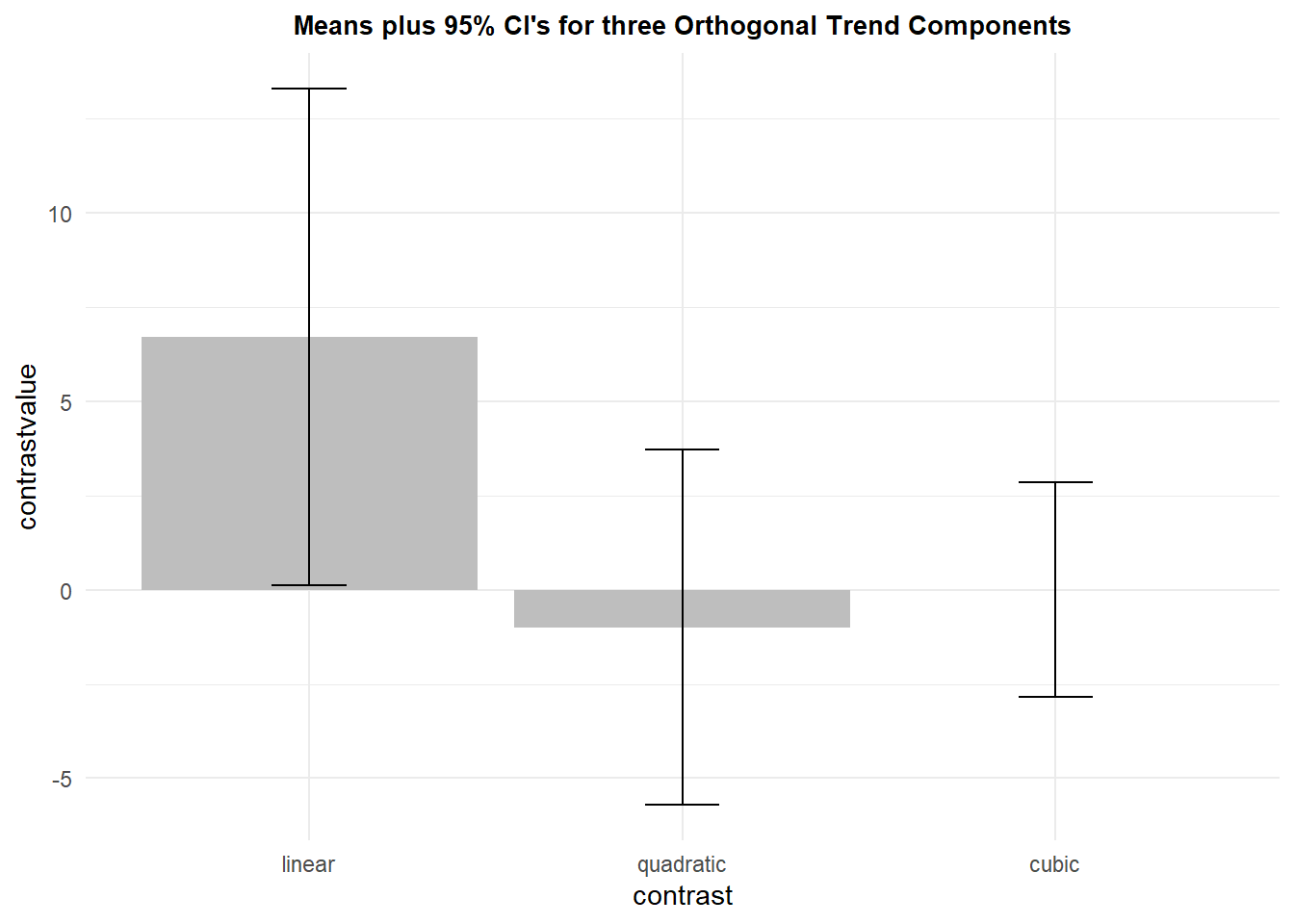
9.1.6 Conclusion on Univariate approach to trend contrasts and specific error terms
Specific error terms will typically be important to use but this direct computational method is not the most efficient. It will be more challenging to use this direct method for more complex designs - more repeated factors or mixed designs with between-groups factors. It appears that there is no other way in R to obtain these specific error term based tests.
We can also address conclusions on this analysis. The linear trend component was the only one that was significant, using these standard NHST methods. However, the size of the effect is not large. The mean is about .65 standard deviations away from the null value of zero (see the summary.trend object above). Although viewed as a effect size statistic (“d”), this value would be labeled moderate or large. But if we think back to the original profile plot for this data set, the pattern of increases was not clearly consistent for the twelve subjects and some of them showed no increase across age. Only two of them showed the clear linear pattern of increases from each measurement to the next. So what are we to conclude? At this point all we can really say is that there is a modest increase in scores across ages, one that was significant with NHST methods for the linear trend component. But are we convinced? Perhaps not. It might be nice to take a Bayesian perspective on the strength of the evidence. The next section take a quick approach to that.
9.1.7 Bayes Factor evaluation for trend.
Once construed as the single trend contrast variable in the previous section, the linear trend variable was analyzed as a one-sample location test, the traditional t-test. There is a very quick way to obtain a Bayes Factor for such one-sample “t-test” applications. The BayesFactor package has a function that can analyze this one sample design and easily provide the Bayes Factor, for assessment of strength of the evidence for the alternative hypothesis. In its default configuration the ttestBF function can provide the Bayes Factor, extracted from the object with the extractBF function.
#library(BayesFactor)
BF10.mdktrendlinear <- extractBF(ttestBF(trendcontrasts$linear), onlybf = TRUE)
BF10.mdktrendlinear
## [1] 1.750326This is a small BF10 value, indicating only weak evidence in support of the alternative hypothesis (a linear trend). It contemplates the two tailed model, but that is ok here since we would typically be interested in a two tailed test with the traditional methods.
So we would probably not argue strenuously for a conclusion that McCarthy scores increase linearly across time.
9.1.8 Linear Mixed Effects Modeling and Trend
A common alternative to the traditional univariate ANOVA performed above is a linear mixed effects analysis of repeated measures data. Setting this analysis up follows the approach oulined in chapter 5, and we will use the lme function from the nlme package.
First, we can look at the covariance and correlation matrices for the four levels of the repeated measure factor, using the wide format data frame. This is to provide assistance in choosing the type of covariance structure to model with the lme analysis. For time varying measurements, it is expected that the covariance stucture follows a first order autoregressive pattern. That is, measurements closer in time to one another are more strongly covarying. That is somewhat the case for this data set, but the pattern is not perfect.
cov(mdkwide[,2:5])## thirty_months thirtysix_months fortytwo_months
## thirty_months 188.0000 154.36364 127.3636
## thirtysix_months 154.3636 200.54545 143.6364
## fortytwo_months 127.3636 143.63636 178.0000
## fortyeight_months 121.1818 97.45455 168.0909
## fortyeight_months
## thirty_months 121.18182
## thirtysix_months 97.45455
## fortytwo_months 168.09091
## fortyeight_months 218.00000cor(mdkwide[,2:5])## thirty_months thirtysix_months fortytwo_months
## thirty_months 1.0000000 0.7949863 0.6962361
## thirtysix_months 0.7949863 1.0000000 0.7602352
## fortytwo_months 0.6962361 0.7602352 1.0000000
## fortyeight_months 0.5985912 0.4660875 0.8533083
## fortyeight_months
## thirty_months 0.5985912
## thirtysix_months 0.4660875
## fortytwo_months 0.8533083
## fortyeight_months 1.0000000The first and second models are designed to repeat the univariate ANOVA type of approach. The first model is an intercept only model and the second is a model that contains the age factor. But the second model assumes compound symmetry (which is spherical), and we know this is not a supported assumption (Mauchly test above and pattern of covariances). Nonetheless, this should duplicate the univariate omnibus F test.
# intercept only model
mdk1.lme <- lme(DV ~ 1, random = ~1 | subject/age,
                    method = "ML", data=mdklong)
# Augmented Model with Compound symmetry cov matrix
mdk1a.lme <- lme(DV ~ age, random = ~1|subject,
                       correlation=corCompSymm(form=~1|subject),
                       #correlation=corSymm(form=~1|snum),
                       method = "ML", data=mdklong)
An ANOVA on the “mdk1a.lme” model verifies that the same F/p values are obtained as for the traditional method, and the comparison of the full model with the intercept only model verifies that the age model is a better fit, although not convincingly since the BIC value is larger for the age model (AIC is smaller).
anova(mdk1a.lme)## numDF denDF F-value p-value
## (Intercept) 1 33 929.7391 <.0001
## age 3 33 3.0269 0.0432anova(mdk1.lme, mdk1a.lme)## Model df AIC BIC logLik Test L.Ratio p-value
## mdk1.lme 1 4 373.4653 380.9501 -182.7327
## mdk1a.lme 2 7 370.7143 383.8127 -178.3572 1 vs 2 8.750988 0.0328The next model changes the covariance structure to AR1. When compared to the compound symmetry model, both AIC and BIC are smaller, so AR1 is preferred.
# Augmented Model with AR1 cov matrix
mdk1c.lme <- lme(DV ~ age, random = ~1|subject,
                 #correlation=corCompSymm(form=~1|subject),
                 correlation=corAR1(form=~1|subject),
                 method = "ML", data=mdklong)
anova(mdk1a.lme, mdk1c.lme)
## Model df AIC BIC logLik
## mdk1a.lme 1 7 370.7143 383.8127 -178.3572
## mdk1c.lme 2 7 362.3200 375.4184 -174.1600Somewhat surprisingly, the anova on the AR1 model does not return a significant effect of age. This reinforces the concerns we developed with the univariate approach about the strength of the age effect.
anova(mdk1c.lme)## numDF denDF F-value p-value
## (Intercept) 1 33 904.3556 <.0001
## age 3 33 1.9392 0.1424Nonetheless, since at least the linear trend component was likely to be an a priori hypothesis, we can attempt to evaluate the trend components with the glht function. The trend contrasts were created wtih the whole number pattern of coefficients that is appropriate for equally spaced factor levels.
As was the case in chapter 5, we note that the tests provided by glhtare z tests and thus approximations, as are the p values. Here we find some support for a linear trend.
trendcontrasts2<- rbind("linear" = c(-3,-1,1,3),
               "quadratic" = c(1,-1,-1,1),
               "cubic" = c(1,-3,3,-1))
trendcontrasts.lmm <- glht(mdk1c.lme, linfct = mcp(age = trendcontrasts2))
summary(trendcontrasts.lmm)
##
## Simultaneous Tests for General Linear Hypotheses
##
## Multiple Comparisons of Means: User-defined Contrasts
##
##
## Fit: lme.formula(fixed = DV ~ age, data = mdklong, random = ~1 | subject,
## correlation = corAR1(form = ~1 | subject), method = "ML")
##
## Linear Hypotheses:
## Estimate Std. Error z value Pr(>|z|)
## linear == 0 3.000e+01 1.236e+01 2.428 0.0448 *
## quadratic == 0 -2.000e+00 3.595e+00 -0.556 0.9241
## cubic == 0 -1.498e-14 6.356e+00 0.000 1.0000
## ---
## Signif. codes: 0 '***' 0.001 '**' 0.01 '*' 0.05 '.' 0.1 ' ' 1
## (Adjusted p values reported -- single-step method)9.1.9 General conclusion regarding trend for the Age factor.
The inconsistent pattern of evidence in support of a linear increase in scores across age is not an unusual or surprising outcome. The real answer here is that the linear increase is inconsistent across this set of 12 subjects. A larger sample size would likely have led to a more clear conclusion. This is an interesting message, that even with an N of 12 in a repeated measures design, evidence for weak or modest effects is difficult. The reader should once again refer to the profile plot to see why this is a reasonable outcome and conclusion. The subjects are simply not consistently showing any specific shape of change across time, and some are not even increasing. The aggregate is largely linear and enough so to produce significance with a traditional NHST test.
One caution is not to place too much emphasis on what this example says for the illustration regarding McCarthy scores. The data set is a hypothetical data set and we saw some patterns in it that made it clear that it was a textbook example where the data were likely created by the author rather than real data. For example it is curious that the mean value for the quadratic trend variable was exactly 1.0, and that the covariance matrix was not more clearly AR1. The primary message here is in the code sequence, not the outcome for this particular hypothesized study.
9.2 A Pre-Post design
Another primary use of repeated measures designs is in the so-called Pre-post design. One or more baseline measurements are made of the outcome variable and a treatment is then applied and perhaps continued. Later measures after the treatment (post) are then taken. The design could be as simple as one “Pre” measurement and one “Post” measurement and that repeated measures design analysis via traditional NHST would be the same as a dependent samples t-test. But additional pre-treatment or post-treament measurements might also occur.
An illustration of this design is provided by the Howell (2013) textbook with the data in table 14.3. A study by Blanchard and colleagues (“Temperature biofeedback in the treatment of migraine headache”. Archives of General Psychiatry, 35:581-588, 1978) evaluated the impact of migraine headache occurrence in patients prior to or after the administration of a treatment regimen involving temperature biofeedback. There were four baseline weeks prior to treatment and six weeks after treatment. Howell presents data for the last two baseline weeks and the final three weeks after treatment began, thus the repeated measure factor has five levels. Howell did not provide the original data, but rather, simulated the outcome reported in the Blanchard paper. In research studies such as this, there might be expected to be a control group that was similarly measured, but did not receive treatment. That would comprise a so-called mixed design, with the treatment group factor being a between-groups factor and the repeated testing the repeated measure factor. In this analysis in the Howell text, and here, only the treatment group is shown since the Howell chapter and this chapter are on one-factor repeated measure designs.
This illustration is included here because we will see how the design provides a nice example of why the omnibus F test is often not very interesting. Instead, the primary rationale for the study and the hypotheses of interest, are better couched as contrasts.
9.2.1 Import the data and perform EDA
The data set imported here is not the exact data set that the Howell textbook provides. I have altered a few pieces of the data to better simulate what might be reasonably expected covariances among the pairs of the five levels of the repeated measure factor. The dependent variable is an index of headache severity comprised from a combination frequency and duration records. The initial data set is in a .csv file.
howell14.3wide <- read.csv("data/howell_tab14-3wideb.csv")
knitr::kable(howell14.3wide)| Subject | baseline1 | baseline2 | training1 | training2 | training3 |
|---|---|---|---|---|---|
| 1 | 21 | 22 | 8 | 6 | 5 |
| 2 | 20 | 19 | 10 | 4 | 3 |
| 3 | 17 | 15 | 8 | 4 | 4 |
| 4 | 25 | 30 | 13 | 12 | 10 |
| 5 | 30 | 27 | 13 | 8 | 5 |
| 6 | 19 | 27 | 8 | 7 | 3 |
| 7 | 26 | 16 | 7 | 2 | 3 |
| 8 | 17 | 18 | 8 | 1 | 2 |
| 9 | 26 | 24 | 14 | 8 | 6 |
Much of the work with the data set here will require a long format version of the data set, so pivot_longer is used to convert from wide to long. In addition the Subject variable and the time variable (week of measurement) are specified as factors, rather than numeric variables. And then the order of the time variable is specified in the sequential order that it existed in during the study. Often this last step is necessary because R orders factors alphabetically by default. But in our example the specific reordering was unnecessary because the original variable names (which became the factor levels in the long format data frame) were already properly ordered. So this last specification is placed here as a reminder if this code is used as a template for other situations
howell14.3long <-
  tidyr::pivot_longer(data=howell14.3wide,
                      cols=2:6,
                      names_to="time",
                      values_to="DV")
howell14.3long$Subject <- as.factor(howell14.3long$Subject)
howell14.3long$time <- as.factor(howell14.3long$time)
howell14.3long$time <- ordered(howell14.3long$time,
           levels=c("baseline1", "baseline2", "training1", "training2", "training3"))
Examination of a few lines of the the long format data frame shows the new structure:
psych::headTail(howell14.3long)## Subject time DV
## 1 1 baseline1 21
## 2 1 baseline2 22
## 3 1 training1 8
## 4 1 training2 6
## 5 <NA> <NA> ...
## 6 9 baseline2 24
## 7 9 training1 14
## 8 9 training2 8
## 9 9 training3 6One additional configuration of the data frame is needed. In order to plot the data with an X axis that reflects the successive weeks of the study, we need a numeric variable to code for week. Since the current time variable is a factor, its use on the x axis of a plot will not produce the proper spacing of measurements at weeks 1, 2 (baseline), and 6, 7, 8, (training weeks). So, a numeric time variable is needed:
howell14.3long$timenumeric <- dplyr::recode(
  howell14.3long$time,
  "baseline1" = 1,
  "baseline2" = 2,
  "training1"  = 6,
  "training2" = 7,
  "training3" = 8
)
psych::headTail(howell14.3long)
## Subject time DV timenumeric
## 1 1 baseline1 21 1
## 2 1 baseline2 22 2
## 3 1 training1 8 6
## 4 1 training2 6 7
## 5 <NA> <NA> ... ...
## 6 9 baseline2 24 2
## 7 9 training1 14 6
## 8 9 training2 8 7
## 9 9 training3 6 8Descriptive statistics can quickly be obtained with the summarySE function in the Rmisc package. The “ci” variable found in the data framed produced by summarySE is the distance up and down from the mean to produce the full CI (95% here). Work in chapter 2 of this document might suggest that a different computation of standard error should be done,reflecting the standard error and the ci for purposes of plotting the repeated measures design, but the ensuing graphs do not plot error bars, so it is unnecessary. summarySE is used here in order to obtain the means associated with the numerically- coded “week” variable.
summary.h143 <- Rmisc::summarySE(howell14.3long,
                                 measurevar="DV",
                                 groupvars="timenumeric",
                                 conf.interval=.95)
knitr::kable(summary.h143)| timenumeric | N | DV | sd | se | ci |
|---|---|---|---|---|---|
| 1 | 9 | 22.333333 | 4.582576 | 1.5275252 | 3.522480 |
| 2 | 9 | 22.000000 | 5.338539 | 1.7795130 | 4.103564 |
| 6 | 9 | 9.888889 | 2.713137 | 0.9043789 | 2.085501 |
| 7 | 9 | 5.777778 | 3.419714 | 1.1399047 | 2.628625 |
| 8 | 9 | 4.555556 | 2.403701 | 0.8012336 | 1.847648 |
The first plot is a line graph of the week by week means of the DV. Raw data points are also plotted to provide a sense of dispersion. The ggplot axis coordinates are determined with the numerically coded time variable in the initial aesthetic and that is found in use of the summarized data frame. But the raw data points come from the full long-formate data frame, which also has the numerically coded time variable. The line geom uses the summary data frame and the y axis specification from the summary data frame is the means. So be careful in reading the code. In the first geom (jitter), y=DV refers to individual data points, but in the line geom and the second point geom, y=DV refers to the means from the summary data frame. The x axis labels are changed from the original numeric codes of “timenumeric” to the labels that describe the exact week/condition and this is accomplished with the “scale_x_continuous” phrasing. Other attributes of the graph are created with more self explanatory options. Finally, notice that the plot of the raw data points uses geom_jitter instead of geom_point in order to counter the fact that multiple data points are drawn at the same position, obscuring the individual points if one uses geom_point.
pp1 <- ggplot(data=summary.h143, aes(x=timenumeric, y=DV)) +
  geom_jitter(data=howell14.3long, aes(x=timenumeric, y=DV),
              width=.1) +
  geom_line(data=summary.h143, aes(x=timenumeric, y=DV)) +
  geom_point(data=summary.h143,aes(x=timenumeric, y=DV),color="blue", size=4) +
  ylab("Headache Score") +
  xlab("Week") +
  ggtitle("Mean Scores as a function of Week Plus Raw Data Points") +
  scale_x_continuous(breaks=c(1,2,6,7,8),
                     labels = c("baseline1","baseline2", "training4", "training5", "training6")) +
  theme_minimal() +
  theme(plot.title = element_text(size=10,
                                  face = "bold", hjust = .5))
pp1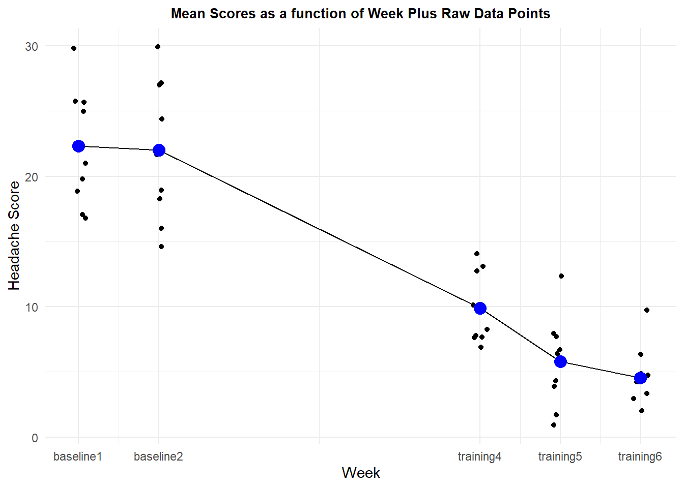
A profile plot provides information on how the individual cases respond across the measurement times. There is considerable consistency across subjects in that they all report diiminished headache severity by the fourth week of training, relative to their own baseline values.
p2 <- ggplot(howell14.3long, aes(timenumeric, DV, colour=Subject)) +
  geom_point(size = 2.5) +
  geom_line(aes(group = Subject), size = 1) +
  scale_x_continuous(breaks=c(1,2,6,7,8),
                     labels = c("baseline1","baseline2", "training4", "training5", "training6")) +
  xlab("Week") +
  ylab("Headache Score") +
  scale_colour_grey() +
  ggtitle("Profile Plot of Score by Subject") +
  theme_minimal() +
  theme(legend.position = "none") + # removes legend
  theme(plot.title = element_text(size=10,
                                  face = "bold", hjust = .5))
p2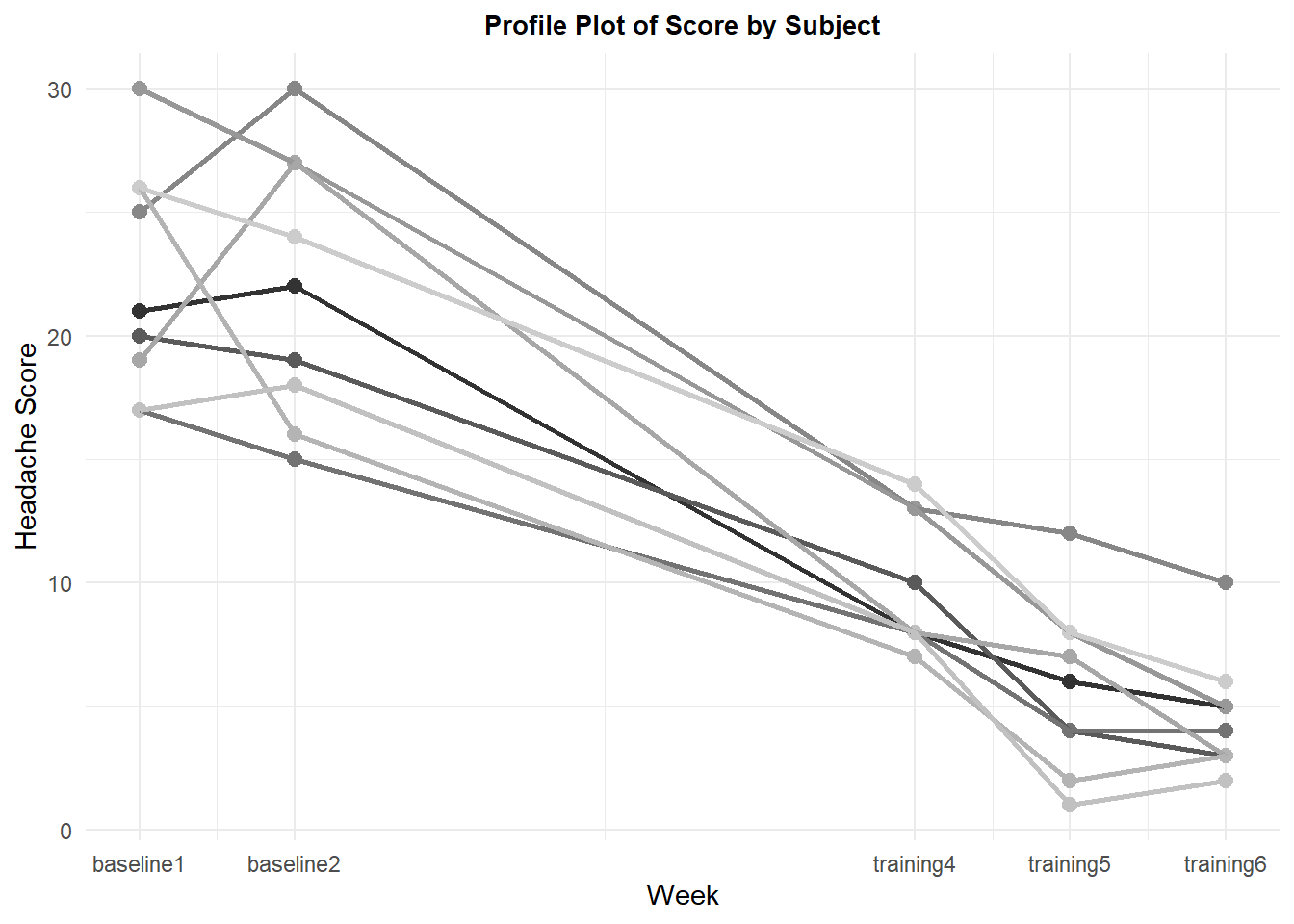
9.2.2 The omnibus analysis: Why?
In this section, the omnibus ANOVA is performed, and the 4 df effect of time was significant. But this is a fairly uninteresting outcome. There are just too many different patterns of outcome that would give rise to a significant F test with five conditions. The study design clearly indicated a few likely a priori contrasts that will be evaluated below. One can justify an assertion that the omnibus F test here is neither required nor useful - should we proceed directly to assessment of the a priori contrasts?
Perhaps not. There is some value in examining the degree to which the sphericity assumption is violated. If it appears to not be violated, then one might argue that use of the omnibus A x s error term would be appropriate for the contrasts instead of the specific error term approach advocated in earlier sections and that is performed here. If sphericity holds, then the most efficient method of performing contrast analysis would be with the functions from the emmeans package as seen in chapter 4. But for this data set, we can see here that the GG and HF episilons are both well below 1.0, even though they are also above the lower bound value of .25 for this five condition design. So the information produced by the afex package approach is not completely useless.
contrasts(howell14.3long$time) <- contr.sum
fit1.h143 <- afex::aov_car(DV ~ time + Error(Subject/time), data=howell14.3long,
                    anova_table = list(correction = "GG", es="ges"))
summary(fit1.h143)
##
## Univariate Type III Repeated-Measures ANOVA Assuming Sphericity
##
## Sum Sq num Df Error SS den Df F value Pr(>F)
## (Intercept) 7501.4 1 395.64 8 151.68 1.758e-06 ***
## time 2711.0 4 199.02 32 108.97 < 2.2e-16 ***
## ---
## Signif. codes: 0 '***' 0.001 '**' 0.01 '*' 0.05 '.' 0.1 ' ' 1
##
##
## Mauchly Tests for Sphericity
##
## Test statistic p-value
## time 0.062965 0.044182
##
##
## Greenhouse-Geisser and Huynh-Feldt Corrections
## for Departure from Sphericity
##
## GG eps Pr(>F[GG])
## time 0.56457 4.233e-11 ***
## ---
## Signif. codes: 0 '***' 0.001 '**' 0.01 '*' 0.05 '.' 0.1 ' ' 1
##
## HF eps Pr(>F[HF])
## time 0.797857 6.836594e-159.2.3 Building contrasts
With the need for specific error terms established, this section creates those contrasts individually for each subject/case rather than using an approach that applies the trend coefficients to the condition means. This is the same approach seen in chapter 4 and for trend analysis in the initial part of this chapter.
The coefficient set creates four orthogonal contrasts that might each be argued to be a priori contrasts. The first evaluates whether the average of the three training week conditions differ from the average of the two baseline conditions, and this may be the primary a priori hypothesis around which the study was designed. The second contrast hypotheses that scores at training week four may not have reached to lowest headache severity levels that the last two weeks did and so compares that week four to the average of weeks five and six. Comparison of weeks five and six in the third contrast evaluates the hypothesis that no further drop occurs after week 5. Finally the fourh contrast which compares the two baseline conditions evaluates whether baseline scores are stable in these last two measurements of pre-training.
The contrasts are created as a matrix of coefficients. where each contrast will be a column in the matrix that is produced (but note that the vectors are in rows of the code that creates them). The exact values of the coefficients were chosen so that the scale reflects the questions posed by each of the above hypotheses will be accurately reflected in the values of the means of the new contrast vectors. For example, the mean of the first contrast would be the exact difference in the average of the first two measurements minus the average of the last three measurements. Using weights of the first contrast as, for example, 3 ,3, -2, -2, -2, would pose the same contrast question be the mean of the vector would be larger - a scaling artifact.
Inferences would not depend on the exact values of the coefficients, but only the signs/patterns - and also recall that any set of contrast weights has to sum to zero.
contrasts.time <- matrix(c(1/2, 1/2, -1/3, -1/3, -1/3,
                           0,     0,    1, -1/2, -1/2,
                           0,     0,    0,    1,   -1,
                           1,    -1,    0,    0,    0), ncol=4)
If we wanted to orthonormalize the coefficients, this would be done with a function from the far package. However this is not executed here and is only included for completeness.
contrasts.time <- far::orthonormalization(contrasts.time)Now we assign that coefficient matrix to the time variable in the long format data frame.
contrasts(howell14.3long$time) <- contrasts.time
contrasts(howell14.3long$time)
## [,1] [,2] [,3] [,4]
## baseline1 0.5000000 0.0 0 1
## baseline2 0.5000000 0.0 0 -1
## training1 -0.3333333 1.0 0 0
## training2 -0.3333333 -0.5 1 0
## training3 -0.3333333 -0.5 -1 0We can double check the orthogonality of the set by creating a correlation matrix for all pairs of the four codign vectors and with the describe function, we see that the coefficient values all sum to zero, as they should because their means are zero.
psych::describe(contrasts(howell14.3long$time))## vars n mean sd median trimmed mad min max range skew kurtosis se
## X1 1 5 0 0.46 -0.33 0 0.00 -0.33 0.5 0.83 0.29 -2.25 0.20
## X2 2 5 0 0.61 0.00 0 0.74 -0.50 1.0 1.50 0.65 -1.40 0.27
## X3 3 5 0 0.71 0.00 0 0.00 -1.00 1.0 2.00 0.00 -1.40 0.32
## X4 4 5 0 0.71 0.00 0 0.00 -1.00 1.0 2.00 0.00 -1.40 0.32cor(contrasts(howell14.3long$time))## [,1] [,2] [,3] [,4]
## [1,] 1 0 0 0
## [2,] 0 1 0 0
## [3,] 0 0 1 0
## [4,] 0 0 0 1Next, we use apply the coefficients to the data for each case. This is done efficiently as a matrix operation. The wide format data frame is used, and converted to a matrix with the as.matrix function. This wide format data matrix is a 9x5 matrix. The contrast matrix, seen above, is a 5x4 matrix, thus the matrices are conformable and the produce is the 9x4 matrix desired. Each contrast is represented by nine values for the nine subjects. The four new variables are formatted into a data frame, and the columns are named to reflect the four orthogonal contrasts.
orthcontrasts <- as.matrix(howell14.3wide[,2:6])%*%contrasts(howell14.3long$time)
orthcontrasts <- as.data.frame(orthcontrasts)
colnames(orthcontrasts) <- c("orth1", "orth2", "orth3", "orth4")headTail(orthcontrasts)## orth1 orth2 orth3 orth4
## 1 15.17 2.5 1 -1
## 2 13.83 6.5 1 1
## 3 10.67 4 0 2
## 4 15.83 2 2 -5
## ... ... ... ... ...
## 6 17 3 4 -8
## 7 17 4.5 -1 10
## 8 13.83 6.5 -1 -1
## 9 15.67 7 2 2Prior to analysis, (but post hoc since we also examined the data with graphs/means), we might entertain one more contrast of interest. It might be valuable to compare the final baseline measurement to the first training period measurement (training week 4). If this were indeed a contrast chosen after looking at the data we would classify it as a post hoc contrast.
It can be created as a five element vector.
postcontr1 <- as.matrix(c(0, 1, -1, 0, 0),nrow=5)
postcontr1
## [,1]
## [1,] 0
## [2,] 1
## [3,] -1
## [4,] 0
## [5,] 0Next, we use the familiar matrix multiplication operation to create a new contrast vector with a value for each case from the wide format data frame and we call this data vector “posthoc1”. This time the wide data frame is converted to a matrix within the same line of code as the matrix multiplication is accomplished.
posthoc1 <- as.matrix(howell14.3wide[,2:6])%*%postcontr1
posthoc1
## [,1]
## [1,] 14
## [2,] 9
## [3,] 7
## [4,] 17
## [5,] 14
## [6,] 19
## [7,] 9
## [8,] 10
## [9,] 10Now we can bind the original matrix of the orthogonal contrast vectors with this posthoc vector, producing a 9 x 5 matrix: Nine cases and five variables - four planned orthogonal and one post hoc contrast
allcontrasts <- cbind(orthcontrasts,posthoc1)
knitr::kable(allcontrasts)| orth1 | orth2 | orth3 | orth4 | posthoc1 |
|---|---|---|---|---|
| 15.16667 | 2.5 | 1 | -1 | 14 |
| 13.83333 | 6.5 | 1 | 1 | 9 |
| 10.66667 | 4.0 | 0 | 2 | 7 |
| 15.83333 | 2.0 | 2 | -5 | 17 |
| 19.83333 | 6.5 | 3 | 3 | 14 |
| 17.00000 | 3.0 | 4 | -8 | 19 |
| 17.00000 | 4.5 | -1 | 10 | 9 |
| 13.83333 | 6.5 | -1 | -1 | 10 |
| 15.66667 | 7.0 | 2 | 2 | 10 |
###Evaluating the contrasts for the pre-post design.
Following the approach outlined above in chapter 4 and in the trend analysis section of this chapter, we submit each of these new variables to a one-sample t-test with a null hypothesis that the mean is zero. The results of these t-tests would be identical to the F tests done a more traditional way that students would have been familiar with from using the SPSS MANOVA procedure - the squares of these t’s would be those F values.
There is a question of alpha rate adjustment for multiple comparisons since we have done five tests. It can be argued that the four planned orthogonal contrasts can be tested at a nominal, non-adjusted, alpha level (.05), but the post hoc test should have some adjustment applied. Since five tests were done, a bonferroni adjustment would set the alph level at .01. This is why I chose the CI for the post hoc contrast as a 99% CI and lef the orthogonal ones at their default 95% values.
t1 <- t.test(allcontrasts$orth1, mu=0, alternative="two.sided")
t2 <- t.test(allcontrasts$orth2, mu=0, alternative="two.sided")
t3 <- t.test(allcontrasts$orth3, mu=0, alternative="two.sided")
t4 <- t.test(allcontrasts$orth4, mu=0, alternative="two.sided")
t5 <- t.test(allcontrasts$posthoc1, mu=0, alternative="two.sided", conf.level = .99)
t1
##
## One Sample t-test
##
## data: allcontrasts$orth1
## t = 18.083, df = 8, p-value = 8.979e-08
## alternative hypothesis: true mean is not equal to 0
## 95 percent confidence interval:
## 13.45877 17.39308
## sample estimates:
## mean of x
## 15.42593t2##
## One Sample t-test
##
## data: allcontrasts$orth2
## t = 7.2488, df = 8, p-value = 8.815e-05
## alternative hypothesis: true mean is not equal to 0
## 95 percent confidence interval:
## 3.219984 6.224461
## sample estimates:
## mean of x
## 4.722222t3##
## One Sample t-test
##
## data: allcontrasts$orth3
## t = 2.1368, df = 8, p-value = 0.0651
## alternative hypothesis: true mean is not equal to 0
## 95 percent confidence interval:
## -0.09676476 2.54120920
## sample estimates:
## mean of x
## 1.222222t4##
## One Sample t-test
##
## data: allcontrasts$orth4
## t = 0.19612, df = 8, p-value = 0.8494
## alternative hypothesis: true mean is not equal to 0
## 95 percent confidence interval:
## -3.586120 4.252787
## sample estimates:
## mean of x
## 0.3333333t5##
## One Sample t-test
##
## data: allcontrasts$posthoc1
## t = 8.9147, df = 8, p-value = 1.987e-05
## alternative hypothesis: true mean is not equal to 0
## 99 percent confidence interval:
## 7.552624 16.669598
## sample estimates:
## mean of x
## 12.11111An alternative way to do the multiple comparison adjustment is to submit the set of p values to the p.adjust procedure and that is done here with the Holm method, just illustrate the alternative possibilities for adjusted p values. It was argued that the adjusted p value would only be needed for the final contrast (the post hoc one), but all are included in case the adjustment is desired for all of them and to provide the right number of tests for the Holm method to operate on.
The final contrast is significant even with this Holm adjustment.
p.adjust(c(t1$p.value,t1$p.value,t2$p.value,
           t3$p.value,t4$p.value,t5$p.value), method="holm")
## [1] 5.387577e-07 5.387577e-07 2.644635e-04 1.301942e-01 8.494094e-01
## [6] 7.949708e-059.2.4 Visualization of the contrasts
Even though the comparisons of the five contrasts could be visualized from the original line graph of this data set (and perhaps the profile plot), it can be useful to plot the means of the five contrasts as a bar graph and add confidence intervals based on the specific errors embodied in the variances of those five variables.
First we need to convert the wide format data matrix of the five contrasts to a long format.
contrastslong <-
  tidyr::pivot_longer(data=allcontrasts,
                      cols=1:5,
                      names_to="contrast",
                      values_to="contrastvalue")
contrastslong$contrast <- ordered(contrastslong$contrast,
                              levels=c("orth1", "orth2", "orth3",
                                       "orth4", "posthoc1"))
contrastslong
## # A tibble: 45 × 2
## contrast contrastvalue
## <ord> <dbl>
## 1 orth1 15.2
## 2 orth2 2.5
## 3 orth3 1
## 4 orth4 -1
## 5 posthoc1 14
## 6 orth1 13.8
## 7 orth2 6.5
## 8 orth3 1
## 9 orth4 1
## 10 posthoc1 9
## # … with 35 more rowsNext, we once again use summarySE to extract the relevant summary information. Note that I requested a 99% confidence interval even though the 95% interval is probably appropriate for the four orthogonal contrasts. I have not sorted out how to use ggplot to put a different CI on different bars of the same graph, so I went with 99% for all here.
summary.allcontr <- Rmisc::summarySE(contrastslong,
                                  measurevar="contrastvalue",
                                  groupvars="contrast",
                                  conf.interval=.99)
summary.allcontr
## contrast N contrastvalue sd se ci
## 1 orth1 9 15.4259259 2.559176 0.8530587 2.862342
## 2 orth2 9 4.7222222 1.954340 0.6514466 2.185856
## 3 orth3 9 1.2222222 1.715938 0.5719795 1.919213
## 4 orth4 9 0.3333333 5.099020 1.6996732 5.703062
## 5 posthoc1 9 12.1111111 4.075673 1.3585577 4.558487Now ggplot is used for the typical bar graph with confidence intervals overlaid as “error bars”.
pall <- ggplot(summary.allcontr, aes(x=contrast, y=contrastvalue, fill=contrast)) +
  geom_bar(position=position_dodge(), stat="identity", fill="gray") +
  geom_errorbar(aes(ymin=contrastvalue-ci, ymax=contrastvalue+ci), data=summary.allcontr,
                width=.2,                    # Width of the error bars
                position=position_dodge(.9)) +
  ggtitle("Means plus 99% CI's for four A Priori and one Posthoc Contrast") +
  guides(fill=FALSE) + # removes legend
  theme_minimal() +
  theme(plot.title = element_text(size=10,
                                  face = "bold", hjust = .5))
pall 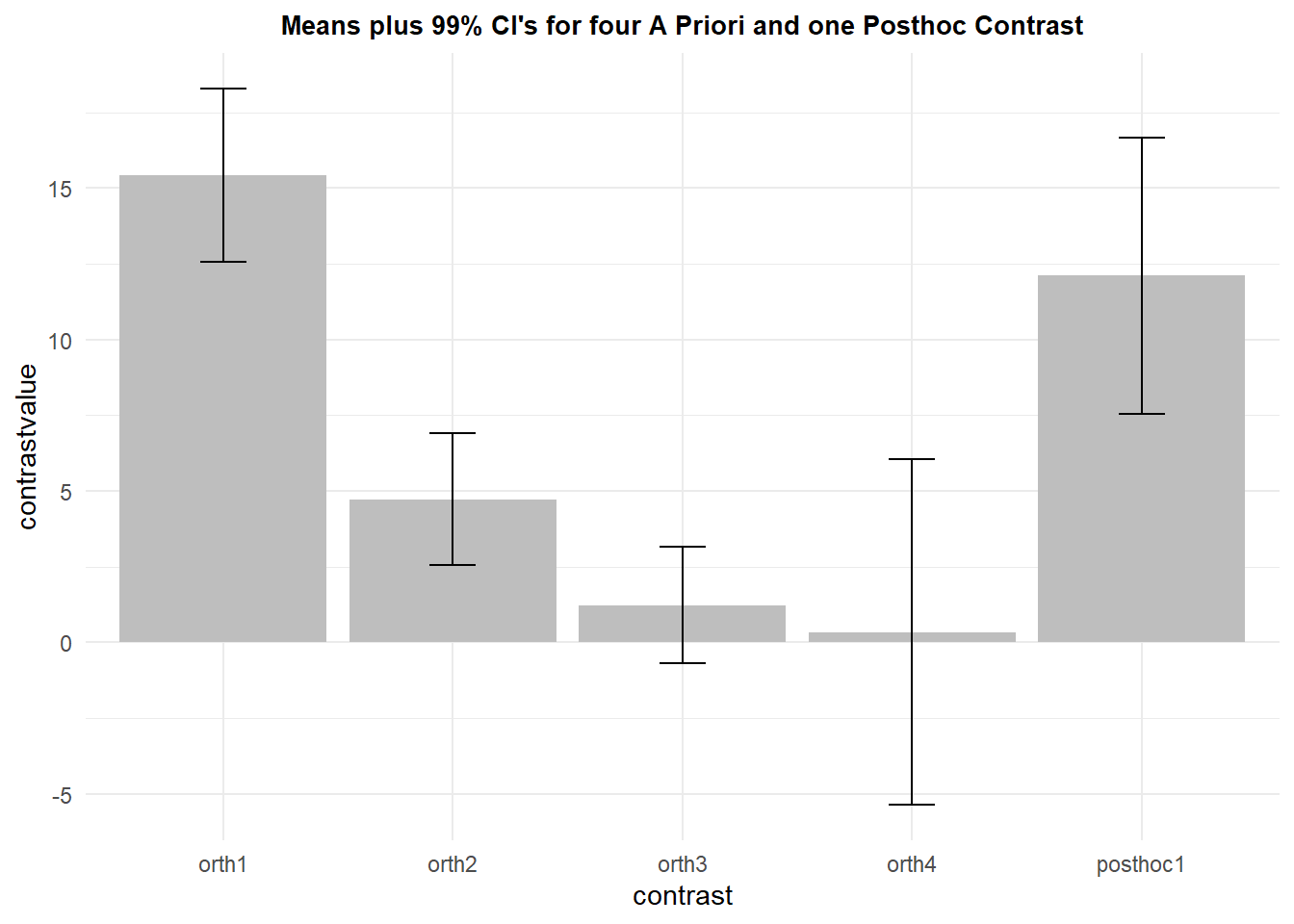
9.2.5 Bayes Factor values for the pre-post contrasts
The BayesFactor package provides a function (ttestBF) for doing a style of Bayesian analysis that creates Bayes Factors for each test that is the one sample t-test. Then we can use extractBF, from the same package, to find the BF10 value. BF10 is interpreted as the relative strength of evidence for support of the alternative hypothesis and I used it for each of the contrasts that were significant as a traditional t-test. All three had extremely large BF10 values, indicating strong support for the alternative hypothesis against the null.
BF10.orth1 <- extractBF(ttestBF(allcontrasts$orth1), onlybf = TRUE)## t is large; approximation invoked.BF10.orth1## [1] 116788.3BF10.orth2 <- extractBF(ttestBF(allcontrasts$orth2), onlybf = TRUE)
BF10.orth2## [1] 312.9519BF10.posthoc1 <- extractBF(ttestBF(allcontrasts$posthoc1), onlybf = TRUE)
BF10.posthoc1## [1] 1108.65The contrasts that were not significant in the traditional t-tests are now characterized with BF01 levels that indicate relative support for the null hypothesis. BF01 is found as the reciprocal of BF10. The third orthogonal contrast led to an inconclusive outcome. Nether BF01, nor BF10 were very far from zero, indicating a situation where evidence for or against the null is weak. The fourth orthogonal contrast produced a modest sized BF01, indicated weak to moderate suppport for the null
BF01.orth3 <- 1/extractBF(ttestBF(allcontrasts$orth3), onlybf = TRUE)
BF01.orth3
## [1] 0.6670013BF01.orth4 <- 1/extractBF(ttestBF(allcontrasts$orth4), onlybf = TRUE)
BF01.orth4## [1] 3.058797In this section, I am implying that supplementing the traditional NHST method with the Bayes Factor score results in a more full characterization of the data and does not require choosing sides in the Frequentist/Bayesian debate. Both sets of information are helpful in describing the results of the study.