Chapter 2 Prepare the data and do Exploratory Data Analysis
The data set used in the first several chapters here comes from an experiment described in the textbook by Hays (1994), section 10.16, pg 399. The study examined whether asynchronous presentation of video and audio recordings of speakers impaired memory of what was viewed/heard. It is a one-factor design, 3 levels. In the synchronous condition (control) audio and visual recordings were synchronized. In the two asynchronous conditions the audio was slightly ahead of the visual image of the speaker’s lips (fast) or slightly behind the visual image (slow). This independent variable is called “factora” in the data set. The dependent variable (called dv in the data set) is number of words recalled from a list of 50 heard by the participant from the presentation of the recording.
2.1 Import and prepare the data set
The data set is found in a .csv file and has equal sample sizes of ten per group. It is thus a “balanced” design, and a “completely randomized” design.
hays <- read.csv("data/hays1.csv",header=TRUE, stringsAsFactors = T)
# better yet, implement the file.choose function so that
# you don't have to change the default folder
# hays <- read.csv(file.choose(),header=TRUE, stringsAsFactors=T)
# note that the initial data frame sees the dv as
# integer rather than numeric, so....
hays$dv <- as.numeric(hays$dv)
# show the structure of the data frame
str(hays)
## 'data.frame': 30 obs. of 2 variables:
## $ factora: Factor w/ 3 levels "control","fast",..: 1 1 1 1 1 1 1 1 1 1 ...
## $ dv : num 27 28 33 19 25 29 36 30 26 21 ...#hays
# I will use the attach function here to simplify our code even though
# current best practices in R recommend against using it.
# The downside of using attach is not encountered in this illustration
attach(hays)2.2 Numerical Summaries
Basic description of the DV as a function of factora is accomplished the the ‘describeBy’ function from psych.
describeBy(dv, group=factora, type=2)##
## Descriptive statistics by group
## group: control
## vars n mean sd median trimmed mad min max range skew kurtosis se
## X1 1 10 27.4 5.1 27.5 27.38 3.71 19 36 17 -0.04 -0.09 1.61
## ------------------------------------------------------------
## group: fast
## vars n mean sd median trimmed mad min max range skew kurtosis se
## X1 1 10 21.2 5.2 20.5 20.88 4.45 15 30 15 0.66 -0.65 1.65
## ------------------------------------------------------------
## group: slow
## vars n mean sd median trimmed mad min max range skew kurtosis se
## X1 1 10 21.8 2.53 22.5 22 2.22 17 25 8 -0.7 -0.29 0.82.3 Graphs of Data by Group
There are a great many ways to draw graphs to display data of the type found even in this simple 3-group design. R can produce them with varying degrees of complexity in the code. Several will be demonstrated here. Some of them are quick tactics to “get to know” your data. Others can be seen as close to publication quality.
2.3.1 Simple EDA Plots
First, we can quickly obtain a simple and very basic plot called a stripchart.
stripchart(dv~factora, method="stack")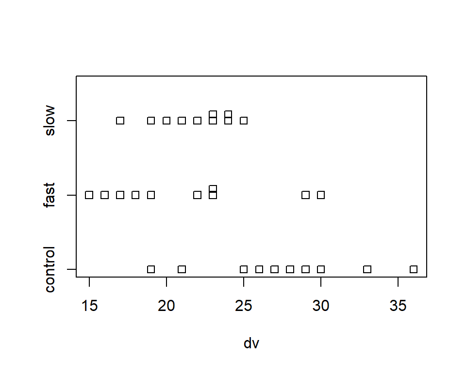
An alternative to the base system stripchart shown above is a simple dot plot. Although there are many ways to accomplish this in R, the dotplot function from the lattice package is simple to use.
# require(lattice)
with(hays, dotplot(dv ~ factora))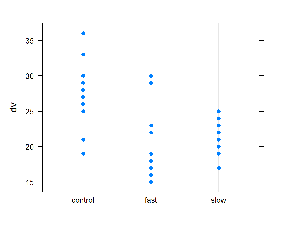
It is always useful to obtain boxplots of the DV for the all groups in a 1-way design. With base system graphics it is possible to display data from multiple conditions on the same plot.
boxplot(dv~factora, data=hays,col="lightgray",ylim=c(0,40),
  main="1-Way treatment study Box Plot Illustration",
  xlab="Treatment Group",
  ylab="Mean Words Recalled")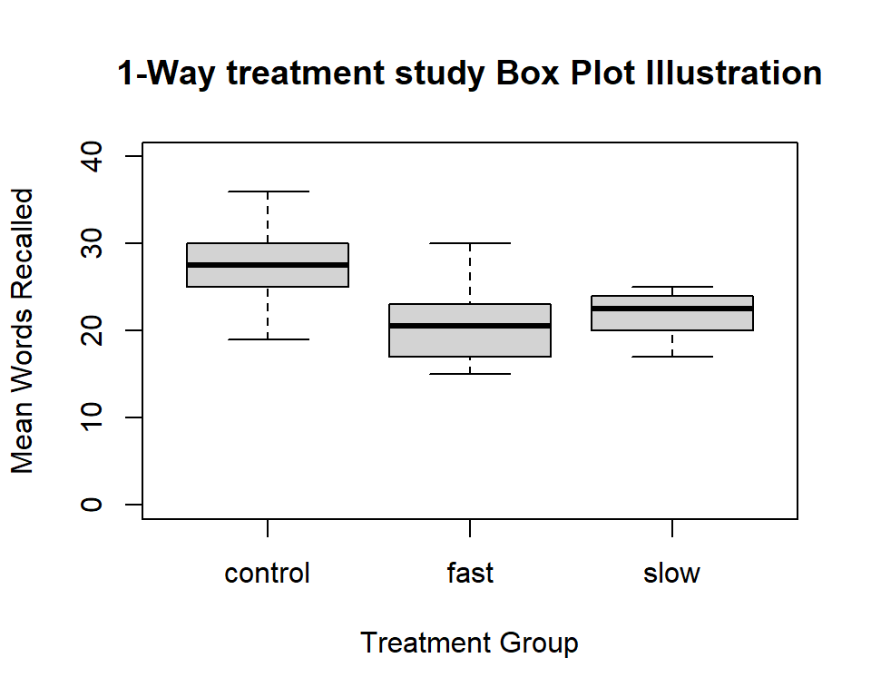
What if we want to truncate the axis and show an axis break? (can’t do in ‘ggplot2’)? Let’s do it for this boxplot. The axis.break function from the plotrix package accomplishes this.
#library(plotrix) # to obtain the axis.break function
boxplot(dv~factora, data=hays,col="lightgray",ylim=c(8,40),
        main="1-Way treatment study Box Plot Illustration",
        xlab="Treatment Group",
        ylab="Mean Words Recalled - note axis truncation")
axis.break(2,8,style="slash")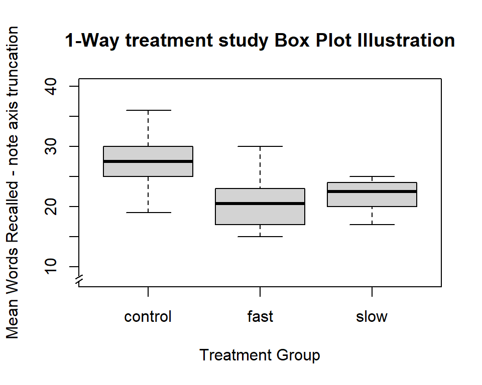
One of Tufte’s axioms is “show the data.” Here, using the beeswarm package, we can draw a box plot with raw data points overlaid. Note that the beeswarm function could have been executed after either of the boxplot graphs drawn above as well. Here it produces the simplest/rudimentary boxplot.
boxplot(dv~factora)
beeswarm(dv~factora,add=T)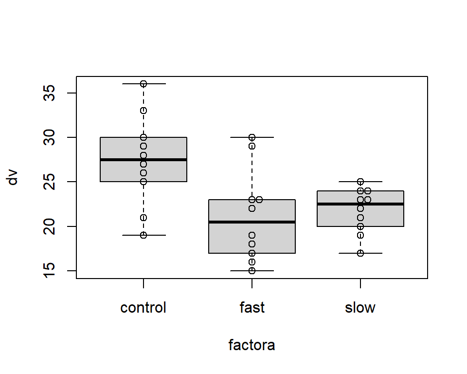
2.3.2 Frequency Histograms
In many situations it is helpful to visualize each group’s DV distribution with a frequency histogram. The data set used in this document has small sample size per group, so the frequency histogram is not likely to be useful beyond what can be seen with the simpler stripchart above. Nonetheless, it is useful to put code in place as a template for use in situations where sample size is larger. The approach taken here uses ‘ggplot2’ to create a plot that employs “small multiples”, where different panels are drawn for each group. It is also possible to create a layout of histograms with the ‘layout’ function for base system graphics, and that approach has already been demonstrated in prior R tutorials.
Here, I kept the ggplot fairly simple so as to be useful for quick EDA.
#library(ggplot2)
# first, the core xy plot specs
hbase <- ggplot(hays, aes(x = dv))
# now the base plot
hbase1 <- hbase + geom_histogram(aes(y=..density..), # change y axis to density
                                 bins=8, colour="black", fill="white") +
                  geom_density()
# now add the specification that creates separate panels for eaach group
hbase2 <- hbase1 + facet_grid(factora ~ .)
hbase2
## Warning: The dot-dot notation
## (`..density..`) was deprecated
## in ggplot2 3.4.0.
## ℹ Please use
## `after_stat(density)` instead.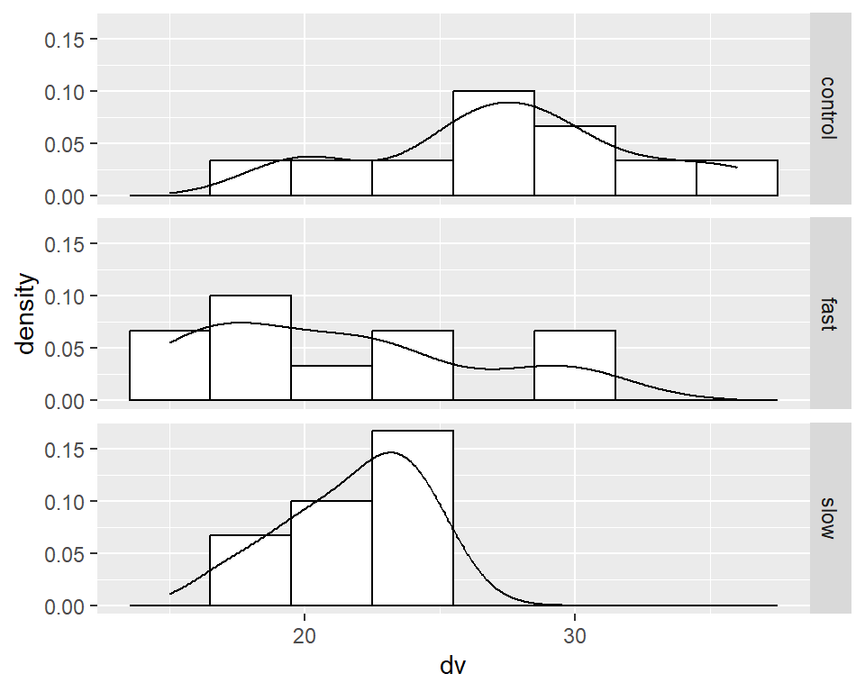
2.3.3 Bar Graphs with Error Bars
The applied sciences rely heavily on a type of bar plots of means, with std errors (or CI’s, or SD’s) displayed as “whiskers”. There is a bit of cottage industry on the web that is heavily critical of these types of graphs, focusing on the fact that information is lost when the data are presented this way. Just do a google search on “dynamite plots” and you will find many blog posts and textbook sections that argue for doing away with them.
Perhaps this is why they are not always simple to obtain in R. Judicious use of them as summary graphs for “ANOVA” types of analyses strikes me as OK. But if one finds that the data have issues of skewness, outliers, or heteroscedasticity, then “showing the raw data points” might be a better approach (c.f. Tufte) - adding raw data onto the bar graph as outlined in the “scientific graphing practices” part of the course.
Notwithstanding this criticism, I have generated some examples of how to draw these graphs in R. I still feel that commercial graphing software such as SigmaPlot or Origins would be a better choice for publication quality graphs of these types.
In the ‘psych’ package, the error.bars.by function gives
a good plot with 95% CI errors as the default.
Other % CI’s can be specified - read the help file: ?error.bars.by
colors of the bars are chosen simply to illustrate the capability.
Use of varying colors would probably not a good choice for either presentation or publication - refer to the BCD discussions of scientific graphing practices.
error.bars.by(hays$dv,hays$factora,bars=TRUE, ylim=c(0,35),
 main="1-Way treatment study \n Means +/- 95%CI",
 xlab="Treatment Group",
 ylab="Mean Words Recalled",
 labels=c("control","fast","slow"),
 #colors=c("lemonchiffon","forestgreen", "springgreen4"))
 colors=c("lightgray","lightgray", "lightgray"))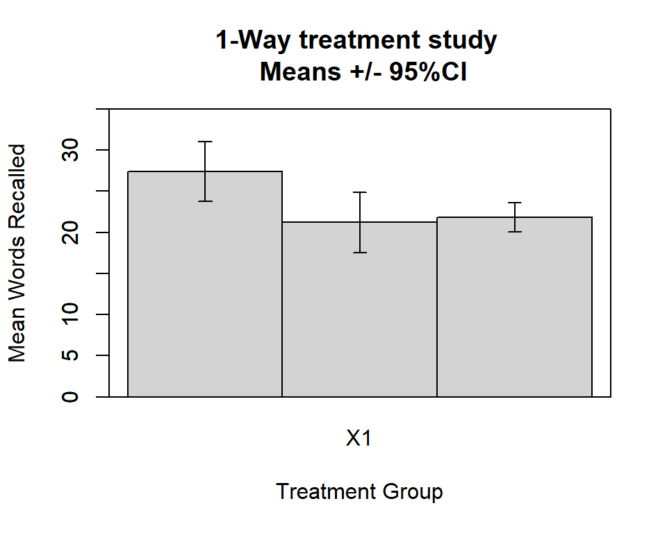
I found, in the asbio package, a function to generate bar graphs +/- either std errors or CI’s. Here is a graph with means +/- std errors.
#require(asbio)
bplot(dv,factora,int="SE",
      xlab="Treatment Group", ylab="Mean Number of Words",
      print.summary=F)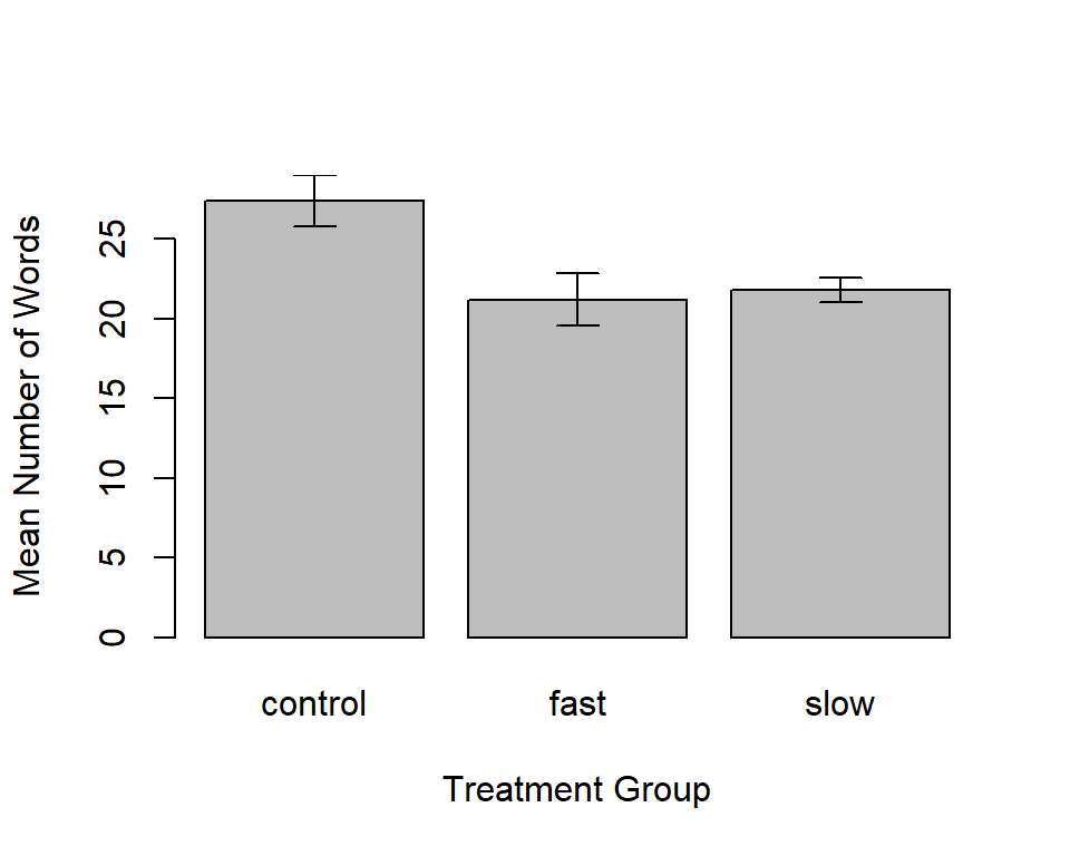
Perhaps a nicer way is available from the from ‘sciplot’ package. default gives +/- 1 std error:
#require(sciplot)
#win.graph() # or quartz() or x11()
bargraph.CI(factora,dv,lc=TRUE, uc=TRUE,legend=T,
            cex.leg=1,bty="n",col="gray75",
            ylim=c(0,33),
            ylab="Mean DV Score",main="Base 1-Way Design Illustration",
            cex.names=1.25,cex.lab=1.25)
box()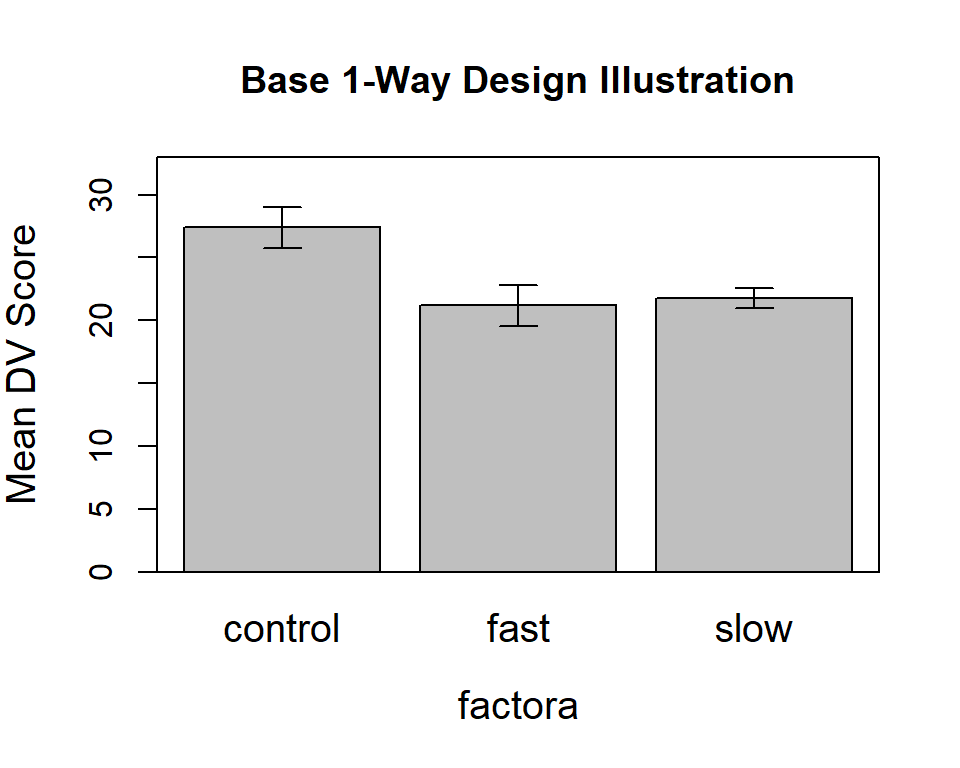
#axis(4,labels=F)Next, we can put an axis break on the Y axis to give a visual indicator of the scale break.
# use the axis.break function from plotrix to give the slashes
library(plotrix)
#win.graph() # or quartz() or x11()
bargraph.CI(factora,dv,lc=TRUE, uc=TRUE,legend=T,
            cex.leg=1,bty="n",col="gray75",
            ylim=c(6,33),
            ylab="MEAN DV Score",main="Base 1-Way Design Illustration",
            cex.names=1.25,cex.lab=1.25)
box()
#axis.break(4,7,style="slash")
axis.break(2,7,style="slash")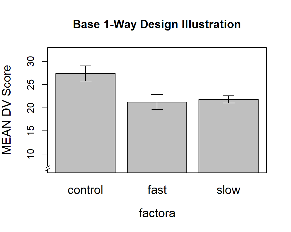
2.3.4 GGPLOT2 can draw boxplots or bar graphs with error bars
The ggplot2 package is a go-to package for visualizations in the data science universe. It is broadly capable and has a different style of programming than base system graphics. It builds on a “grammar of graphics” philosophy, coming from Wilkinson, that is well aligned with object oriented programming. In separate tutorials, basics of ggplot2 programming are taught.
Initally, we will build a boxplot and then a series of bar graphs. Many of the stylistic attributes of a ggplot graph are controlled by the “theme” function. A later section reviews a few alternatives, but for this graph, I prefer a minimal suite of style attributes. This is also a non-standard boxplot in that I added an indicator of the mean of each group since boxplots traditionally only display the median. The blue point indicates the mean. By traditional boxplot definitions, we see no outliers - remembering the relatively small sample sizes, this is not surprising.
pbox <- ggplot(hays, aes(x=factora, y=dv)) +
  geom_boxplot()  +
  stat_summary(fun = mean, geom = "point",
               shape = 16, size = 3.5, color = "blue") +
  xlab("Treatment Group") +
  ylab("Number of Words") +
  ggtitle(" Boxplot of Number of Recalled Words\n Means are added with blue point") +
  theme_minimal() + theme(text=element_text(size=12))
pbox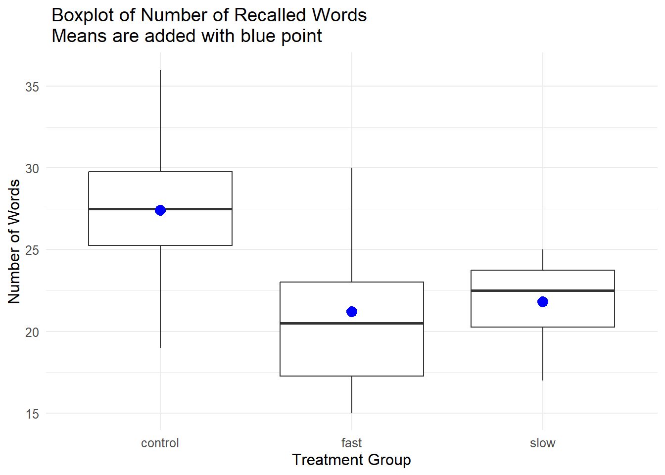
With the traditional bar graph for displaying group means, a decision has to be made about inclusion of error bars. The primary tradition is display of +/- one standard error of the mean, but this prompts some thought about just what the purpose of error bars on a graph is this type is. Some discussion of that takes place in the scientific graphing practices section of the course and a literature is found in the toolkit bibliography as well.
If we are going to plot means and add error bars, the approach requires some preliminary work to establish the means, std errors, sd’s, and CI’s to be used. By default the CI is a 95% range but the value can be changed.
The summarySE function from Rmisc produces a data frame that has the summary stats by group.
ggplot cannot work directly on the data frame to produce this type of plot. We need the summary statistics first.
# now use summarySE on our data
hays_summ <- Rmisc::summarySE(hays, measurevar="dv", groupvars="factora",conf.interval=.95)
str(hays_summ)
## 'data.frame': 3 obs. of 6 variables:
## $ factora: Factor w/ 3 levels "control","fast",..: 1 2 3
## $ N : num 10 10 10
## $ dv : num 27.4 21.2 21.8
## $ sd : num 5.1 5.2 2.53
## $ se : num 1.61 1.65 0.8
## $ ci : num 3.65 3.72 1.81# rename the column that contains the mean to something more less confusing
colnames(hays_summ) <- c("factora", "N", "mean", "sd", "sem", "CI" )
# look at the product
kable(hays_summ)| factora | N | mean | sd | sem | CI |
|---|---|---|---|---|---|
| control | 10 | 27.4 | 5.103376 | 1.613829 | 3.650735 |
| fast | 10 | 21.2 | 5.202564 | 1.645195 | 3.721690 |
| slow | 10 | 21.8 | 2.529822 | 0.800000 | 1.809726 |
Initially, one should consider displaying the raw data points. This is the best way of having a sense of the dispersion of the DV within each group and follows Tufte’s axiom: “Show the Data”. The first code chunk defines the base bar graph and the succeeding one adds on another layer that contains the data points. Note that I changed the theme to one that removes the grid background found above in the boxplot.
p1 <- ggplot(hays_summ, aes(x=factora, y=mean)) +
  geom_bar(position=position_dodge(), stat="identity", fill="gray") +
  xlab("Treatment Group") +
  ylab("Mean Number of Words") +
  theme_classic() + theme(text=element_text(size=12))
#p1
p2 <- p1 + geom_point(data=hays, aes(x=factora, y=dv))+
ggtitle("The Effect of Visual and Auditory\n Stimulus Synchrony on Performance\n Means plus raw data points")
p2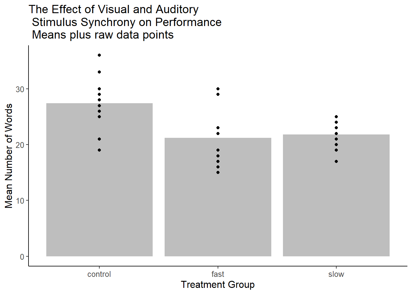
Next, the same base plot is used for the bars, but standard errors of the mean are added, +/- one standard error.
# add on std error bars
#win.graph() # or quartz() or x11()
p3 <- p1 +      geom_errorbar(aes(ymin=mean-sem, ymax=mean+sem),
                              width=.2,  # Width of the error bars
                              position=position_dodge(.9)) +
  ggtitle(" The Effect of Visual and Auditory\n Stimulus Synchrony on Performance\n Means +/- SEM")

p3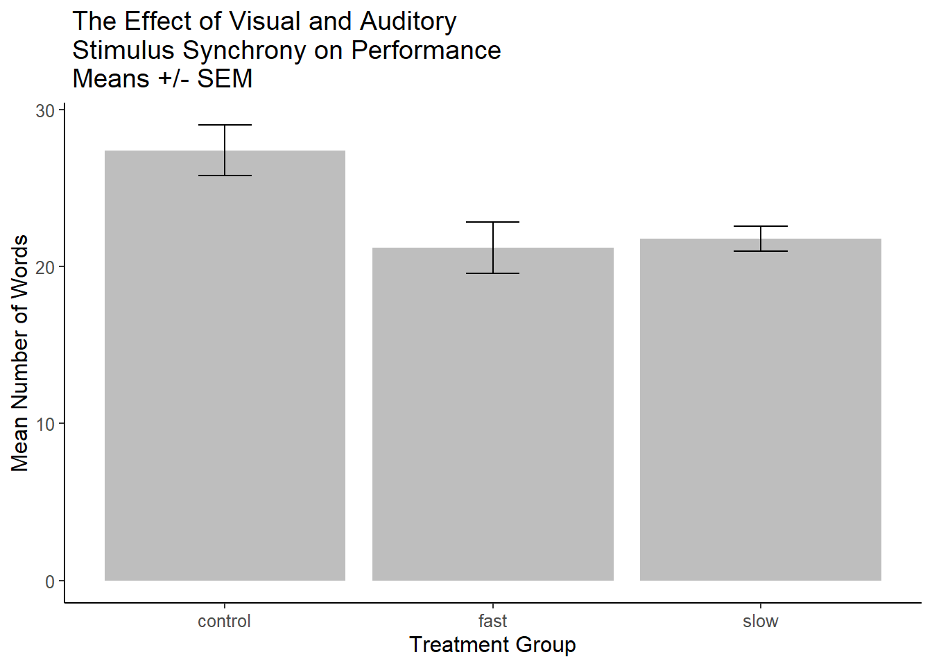
A more finished ggplot2 graph might look like this:
p3base <- ggplot(hays_summ, aes(x = factora, y = mean)) +
  geom_bar(
    position = position_dodge(),
    stat = "identity",
    fill = "gray",
    colour = "black"
  ) +
  geom_errorbar(aes(ymin = mean - sem, ymax = mean + sem),
                width = .2,
                # Width of the error bars
                position = position_dodge(.9)) +
  scale_y_continuous(breaks = 0:30 * 5) +
  xlab("Treatment Group") +
  ylab("Mean Number of Words") +
  ggtitle("The Effect of Visual and Auditory\n Stimulus Synchrony on Performance\n Means +/- SEM")
p3base +  theme_bw()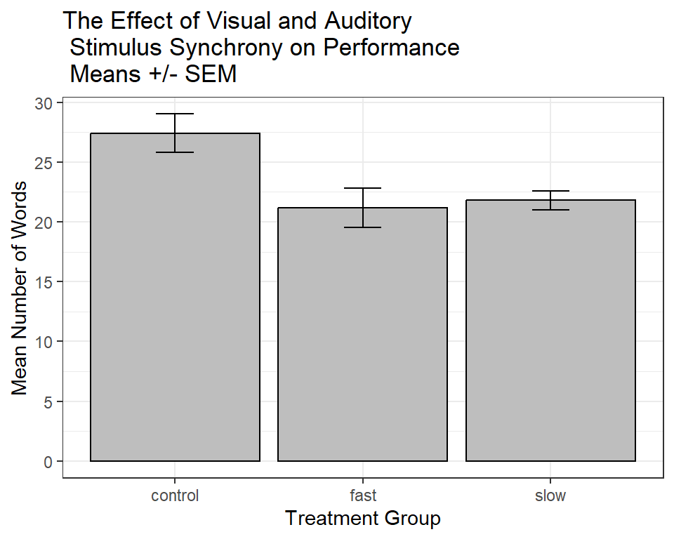
The reader might have noticed a call in this last ‘ggplot2’ graph called theme_bw(). ‘ggplot2’ can handle many different themes available in add-on packages. I use one called ggthemes.
Many other themes are available from the ggthemes package. see [https://cran.r-project.org/web/packages/ggthemes/vignettes/ggthemes.html]
The reader might try any one of the following:
p3base + theme_tufte()
p3base + theme_grey()
p3base + theme_dark()
p3base + theme_economist()
p3base + theme_excel() # very ugly
p3base + theme_few() # from Stephen Few
p3base + theme_fivethirtyeight()
p3base + theme_gdocs()
p3base + theme_hc()
p3base + theme_solarized()
p3base + theme_stata()
p3base + theme_wsj()
p3base + theme_pander()
Sometimes, error bars are chosen to summarize the dispersion of the DV rather than as a noise estimator of the sample mean. One option (in addition to showing the raw data) is to use standard deviations from each group to form the error bars. The error bars extend up and down one standard deviation.
# add on std error bars
p4 <- p1 + geom_errorbar(aes(ymin=mean-sd, ymax=mean+sd),
width=.2, # Width of the error bars
position=position_dodge(.9)) +
ggtitle(" The Effect of Visual and Auditory\n Stimulus Synchrony on Performance\n Means +/- SD")
p4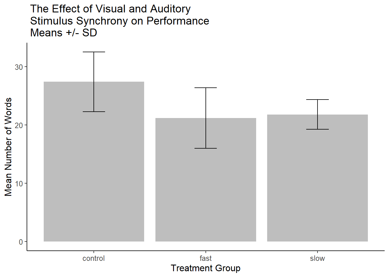 A recommended approach is to show Confidence Intervals rather than SEM’s (see the toolkit bibliography section on confidence intervals). This is easy enough to accomplish since the
 summarySE function also computed the half width of a confidence interval so that it can be used in plotting the “error bars”.
p5 <- p1 + geom_errorbar(aes(ymin=mean-CI, ymax=mean+CI),
width=.2, # Width of the error bars
position=position_dodge(.9)) +
ggtitle(" The Effect of Visual and Auditory\n Stimulus Synchrony on Performance\n Means plus 95%CI")
p5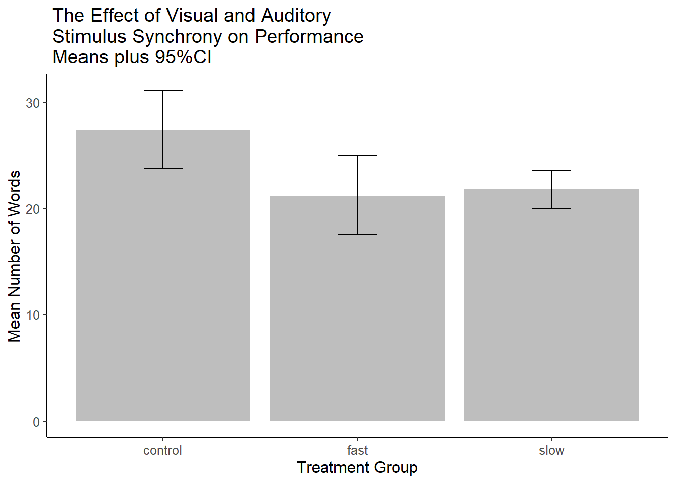 ### Miscl: Dotplots (lattice), Violin plots
One useful plot that we have seen before combines the violinplot (showing kernel density curves) with either a boxplot or, in this case, a dotplot. The violinplot is best used when sample sizes are a bit larger than the n=10 in this hays data set. Nonetheless, the capability is illustrated. This figure is generated using ggplot2 techniques.
ggplot(hays, aes(factora, dv)) +
  geom_violin() + geom_dotplot(binaxis='y', stackdir='center', dotsize=.5) +
  theme_classic()
## Bin width defaults to 1/30 of
## the range of the data. Pick
## better value with `binwidth`.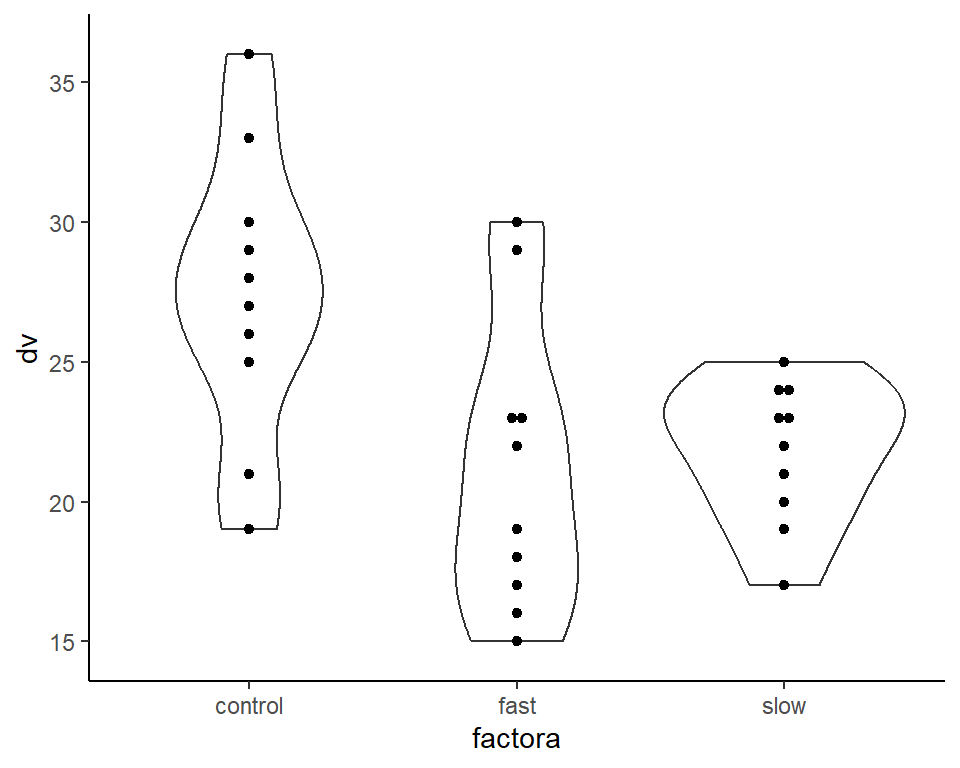
2.3.5 Combining multiple ggplot figures into one layout
The next plot is an illustration of combining multiple graphs into one layout. First, we will use the hays data set, for continuity. But it is not very useful to draw histograms or kernel density functions with such a low sample size, so a second illustration uses the “cereals” data set.
# Modeled after https://dmyee.files.wordpress.com/2016/03/advancedggplot.pdf
#Histogram of DV, by treatment condition
p1<-ggplot(data = hays, aes(x = dv, fill=factora)) +
  geom_histogram(binwidth = .1) +
  scale_colour_grey() + scale_fill_grey() +
  xlab("Mean Number of Words") + ylab("Count") +
  ggtitle("Histograms, by treatment group") +
  theme_minimal() +
  theme(plot.title = element_text(size=10, face = "bold", hjust = 1))

# Boxplots of DV, by treatment condition
p2<-ggplot(data = hays, aes(x = factora, y = dv, fill=factora)) +
  geom_boxplot() +xlab("Treatment Group") + ylab("Number of Words") +
  scale_colour_grey() + scale_fill_grey() +
  ggtitle("Boxplots of DV by Treatment Group") +
  theme_minimal() +
  theme(plot.title = element_text(size=10, face = "bold", hjust = 1))

# Violin plots of DV, by treatment condition
p3<-ggplot(data = hays, aes(x = factora, y = dv, fill=factora)) +
  geom_violin(alpha=.25, color="gray") +
  geom_jitter(alpha=.5, aes(color=factora), position=position_jitter(width=0.3)) +
  scale_colour_grey() + scale_fill_grey() +
  coord_flip() +
  xlab("Treatment Group") + ylab("Number of Words") +
  ggtitle("Violin plots of DV by Treatment Group") +
  theme_minimal() +theme(plot.title = element_text(size=10, face = "bold", hjust = 1))

# Creating a matrix that defines the layout
# (not all graphs need to take up the same space)
lay <- rbind(c(1,2),c(3,3))# Plotting the plots on a grid
grid.arrange(p1, p2, p3, ncol=2, layout_matrix=lay)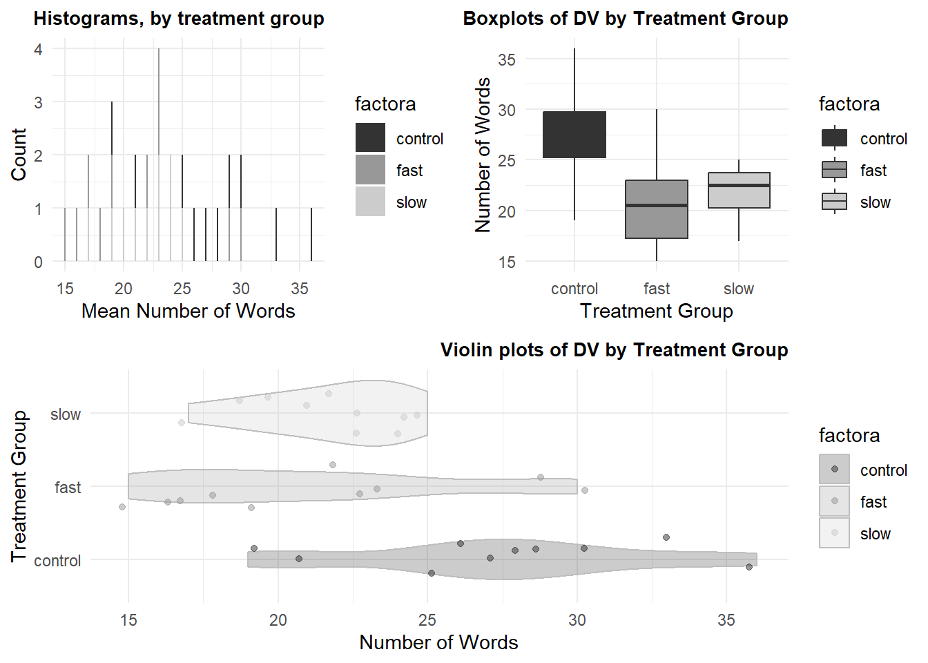
The second illustration uses the “cereals” data set that has been explored for previous course work with SPSS. Here, I chose the dependent variable to be the “Healthiness” rating of each cereal type and the categorical/grouping factor is shelf that the cereal was found on in the supermarket. This second illustration also introduces a way to control color for “fills”, by group, and uses a colorblind friendly palette of colors.
cereals <- read.csv("data/cereal_cold_sugar_shelf.csv", stringsAsFactors=T)# Modeled after https://dmyee.files.wordpress.com/2016/03/advancedggplot.pdf
#Histograms of "Healthiness" Rating" by Shelf
#library("RColorBrewer")
cbPalette <- c("#999999", "#E69F00", "#56B4E9", "#009E73",
"#F0E442", "#0072B2", "#D55E00", "#CC79A7")
p1<-ggplot(data = cereals, aes(x = rating, fill=shelf)) +
geom_histogram(binwidth = .1) +
scale_fill_manual(values=cbPalette) +
#scale_fill_brewer(palette="Paired") +
#scale_colour_grey() + scale_fill_grey() +
xlab("Rating") + ylab("Count") +
ggtitle("Histograms, by Shelf") +
theme_minimal() +
theme(plot.title = element_text(size=10, face = "bold", hjust = 1))
# Boxplots of "Healthiness" Rating" by Shelf
p2<-ggplot(data = cereals, aes(x = shelf, y = rating, fill=shelf)) +
geom_boxplot() +xlab("Shelf") + ylab("Rating") +
scale_fill_manual(values=cbPalette) +
#scale_fill_brewer(palette="Paired") +
#scale_colour_grey() + scale_fill_grey() +
ggtitle("Boxplots of Rating by Shelf") +
theme_minimal() +
theme(plot.title = element_text(size=10, face = "bold", hjust = 1))
# Violin plots of "Healthiness" Rating" by Shelf
p3<-ggplot(data = cereals, aes(x = shelf, y = rating, fill=shelf)) +
geom_violin(alpha=.25, color="gray") +
geom_jitter(alpha=.5, aes(color=shelf), position=position_jitter(width=0.3)) +
scale_fill_manual(values=cbPalette) + scale_colour_manual(values=cbPalette) +
#scale_fill_brewer(palette="Paired") +
#scale_colour_grey() + scale_fill_grey() +
coord_flip() +
xlab("Shelf") + ylab("Rating") +
ggtitle("Violin plots of Rating by Shelf") +
theme_minimal() +theme(plot.title = element_text(size=10, face = "bold", hjust = 1))
# Creating a matrix that defines the layout
# (not all graphs need to take up the same space)
lay <- rbind(c(1,2),c(3,3))# Plotting the plots on a grid
grid.arrange(p1, p2, p3, ncol=2, layout_matrix=lay)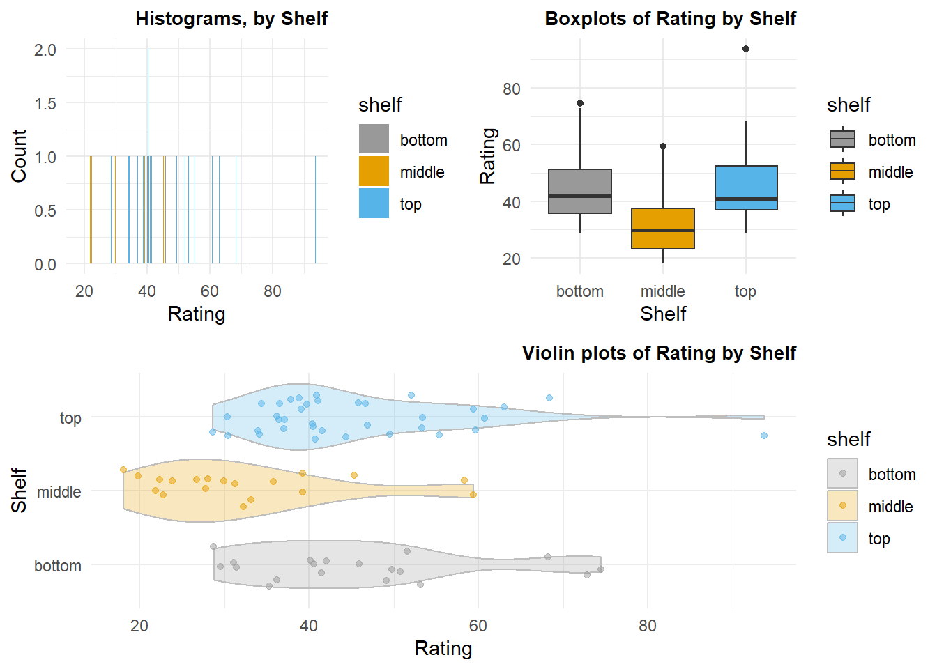
2.3.6 A Caution about Error Bars and Confidence Intervals for Visualizing Inference
There is a common myth that in group comparison studies such as this that non-overlap of 95% CIs between a pair of groups indicates significance with a traditional two-sample test and that overlap indicates non-significance. The reality is different and a discussion of this is found in other course materials and R tutorials. While the former may be true in most circumstances, the latter is not when using a per comparison alpha of .05.
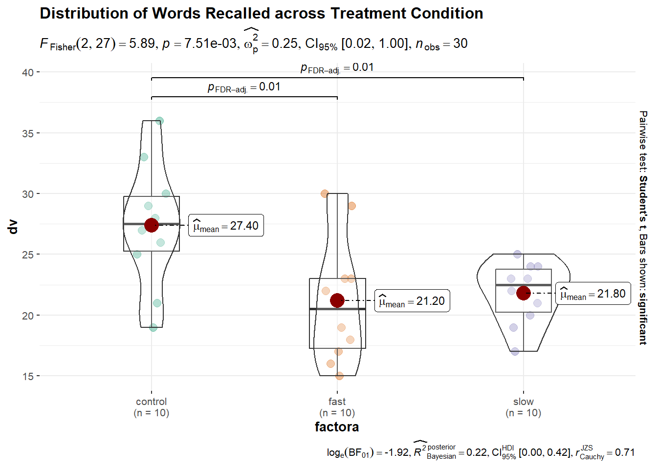
The issue raises the important point of just what the goal of data display is. If to provide an indicator of dispersion, then raw data points or error bars representing standard deviations might be preferred. If an indicator of sampling variation related to the mean is desired, then error bars as SEM’s or CI’s would be preferred. If the goal is “inference by eye”, then some modification of the CI strategy might be appropriate and that literature has been referred to above. More sophisticated graphs can include information about inference as well. One example of this is an easily produced plot from the ggbetweenstats function that is found in the ggstatsplot package. This graph may be too cluttered to be suitable for publication, but it is an example of how simple use of R functions can accomplish many things to facilitate exploratory data analysis and rudimentary inference.
set.seed(123)
p6 <- ggbetweenstats(
  data = hays,
  x = factora,
  y = dv,
  var.equal=T,
  p.adjust.method="fdr",
  #ggtheme="classical",
  title = "Distribution of Words Recalled across Treatment Condition"
)
p6