Chapter 2 Import the Data Set and Do Numerical and Graphical EDA
Cohen, Cohen, West and Aiken (2003) have presented a data set where, ostensibly, faculty salaries are predicted from several IVs. For the detailed example in this document two IVS are used. Both are quantitative: number of publications (pubs) and number of citations (cits). In this illustration all three variables are quantitative and can be thought of as measured on ratio scales (although pubs and cits are integer). The data are in a .csv file. It contains the three variables of interest plus three more. A subject/case number variable, time since PhD degree awarded, and sex. The file is “cohen.csv”. The elaboration of this two-IV example is intended to parallel and extend the implementation previously done with SPSS for the same variables.
2.1 Read the data
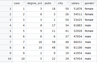
The data file is read and a data frame is produced in the typical manner for .csv files that contain a header row with variable names. We also need to establish that our quantitative variables are read, by R, as numeric variables. We can examine the data frame with the ‘View’ function but I just show the first chunk of the data frame with a screen capture here. Later in this document the additional IVs, degree_yrs, and gender will be considered, but most analyses just use pubs and cits.
Finally, the data frame is “attached” so that easier naming of variables can be accomplished in the many of the initial R functions to be employed. Although this is often not a recommended approach in R, we will not encounter the downside in this document. The data frame will be “detached” prior to use in lm functions.
cohen1 <- read.csv("data/cohen.csv", stringsAsFactors=T)
cohen1$degree_yrs <- as.numeric(cohen1$degree_yrs)
cohen1$pubs <- as.numeric(cohen1$pubs)
cohen1$cits <- as.numeric(cohen1$cits)
cohen1$salary <- as.numeric(cohen1$salary)
#View(cohen1)
attach(cohen1)
Here is a screen capture of what the first few lines of the data frame look like:
2.2 Graphical and Numerical Description of the Variables
The best practices strategy we have put in place prioritizes exploratory data analysis at the outset. “Get to know your Data.” This involves graphical and numerical summaries. The exact approaches taken here are somewhat arbitrary. There are many ways to draw useful graphs in R and an equally large number of ways to obtain numerical descriptive information. The functions used here are similar or identical to those used for previous topics in the course, beginning with the location test problems and progressing through simple regression and bivariate correlation.
2.2.1 Univariate Distributional Displays for each of the three Variables, salary, publications, and citations
Each of our three variables is examined here in several ways. First, I have used base system graphics to plot a few standard exploratory graphs. The basic set of four figures includes the frequency histogram with a kernel density function overlaid, a qq normal probability plot, box plot, and a violinplot.
Salary, the DV is first.
#win.graph(8,6) # use quartz() on MAC OS
layout(matrix(c(1,2,3,4),2,2)) #optional 4 graphs/page
hist(salary,probability=TRUE,breaks=6,
     ylim= c(0, 1.2*max(density(salary)$y)),
     main="Histogram/Density Salary",
     cex.main=.7)
lines(density(salary),col= "red",lwd = 3)
qqnorm(salary,main="Normal Probability Plot of Salary",
       cex.main=.7);qqline(salary)
boxplot(salary,xlab="Salary",ylab="")
violinplot(salary,col="cornsilk",names="Salary")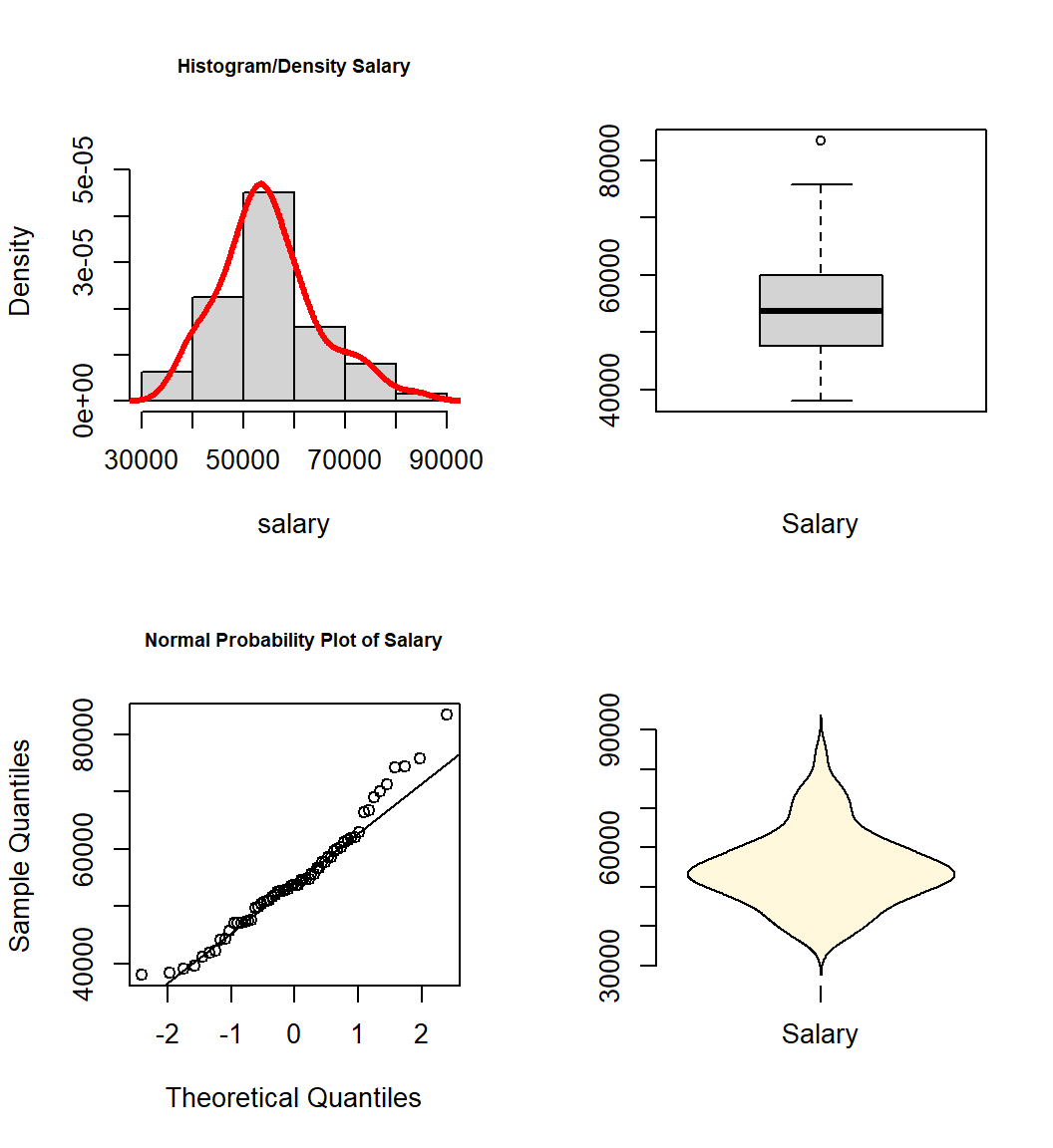
Then, publications and citations, the IV’s.
#win.graph(8,6) # use quartz() on MAC OS
layout(matrix(c(1,2,3,4),2,2)) #optional 4 graphs/page
hist(pubs,probability=TRUE,
     ylim= c(0, 1.5*max(density(pubs)$y)),
     main="Histogram/Density of Publications",
     cex.main=.7)
lines(density(pubs),col = "red",lwd = 3)
qqnorm(pubs,main="Normal Probability Plot of Publications",
       cex.main=.7);qqline(pubs)
boxplot(pubs,xlab="Publications",ylab="")
violinplot(pubs,col="cornsilk",names="Publications")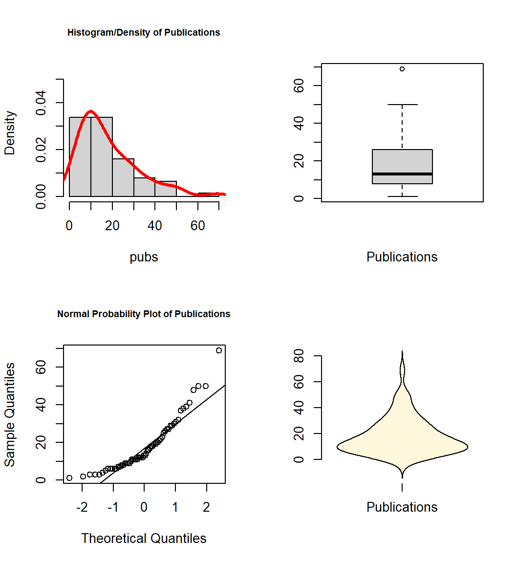
#win.graph(8,6) # use quartz() on MAC OS
layout(matrix(c(1,2,3,4),2,2)) #optional 4 graphs/page
hist(cits,probability=TRUE,
     ylim= c(0, 1.5*max(density(cits)$y)),
     main="Histogram/Density of Citations",
     cex.main=.7)
lines(density(cits),col = "red",lwd = 3)
qqnorm(cits,main="Normal Probability Plot of Citations",
       cex.main=.7);qqline(cits)
boxplot(cits,xlab="Citations",ylab="")
violinplot(cits,col="cornsilk",names="Citations")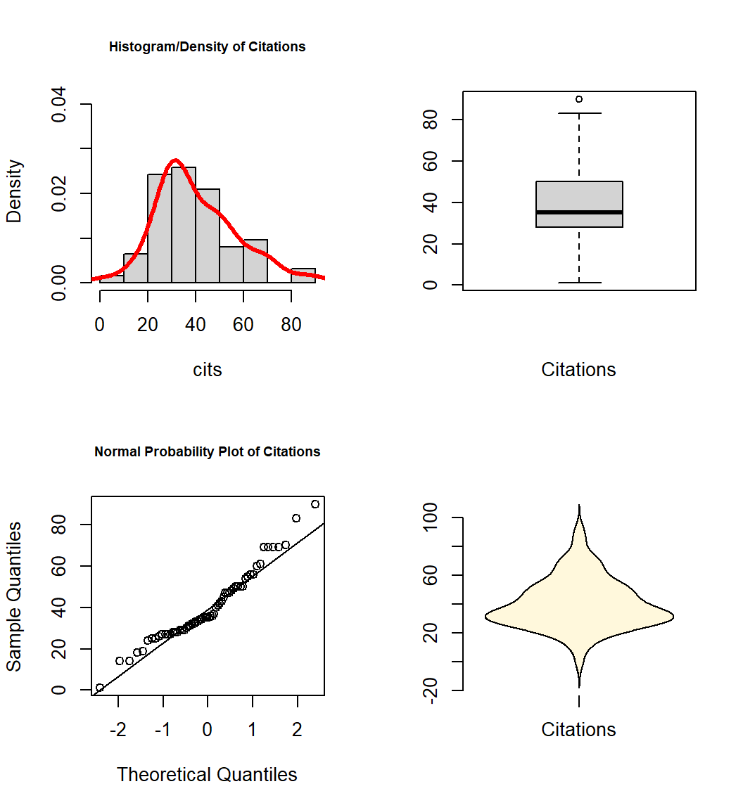
An alternative that is a bit more efficient is to use the ‘explore’ function in the ‘bcdstats’ package. This produces not only graphs, but also numeric summaries of the variables.
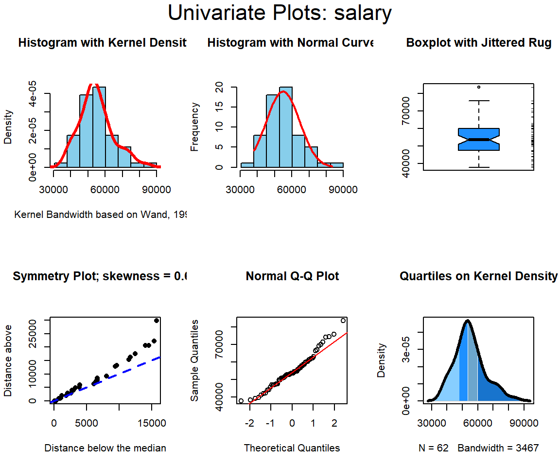
##    vars  n     mean      sd median trimmed     mad   min   max range skew
## X1    1 62 54815.76 9706.02  53681 54226.1 9119.47 37939 83503 45564 0.64
##    kurtosis      se
## X1      0.5 1232.67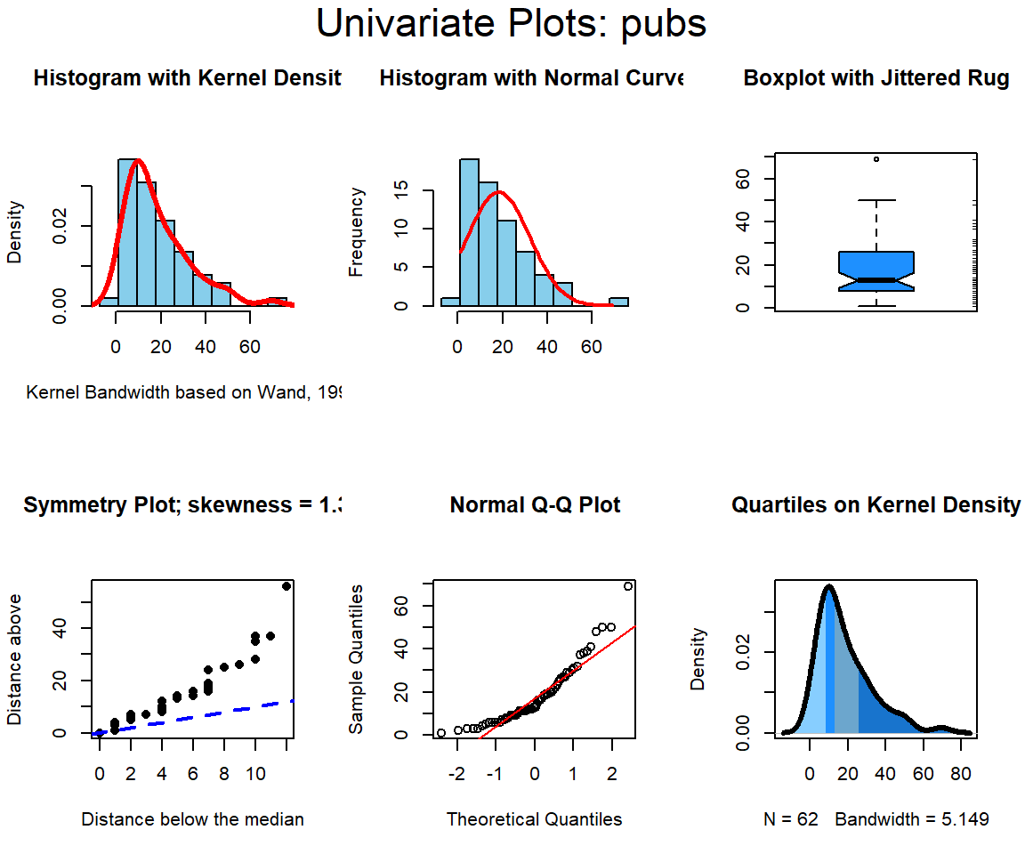
##    vars  n  mean sd median trimmed   mad min max range skew kurtosis   se
## X1    1 62 18.18 14     13   16.28 10.38   1  69    68 1.38     2.01 1.78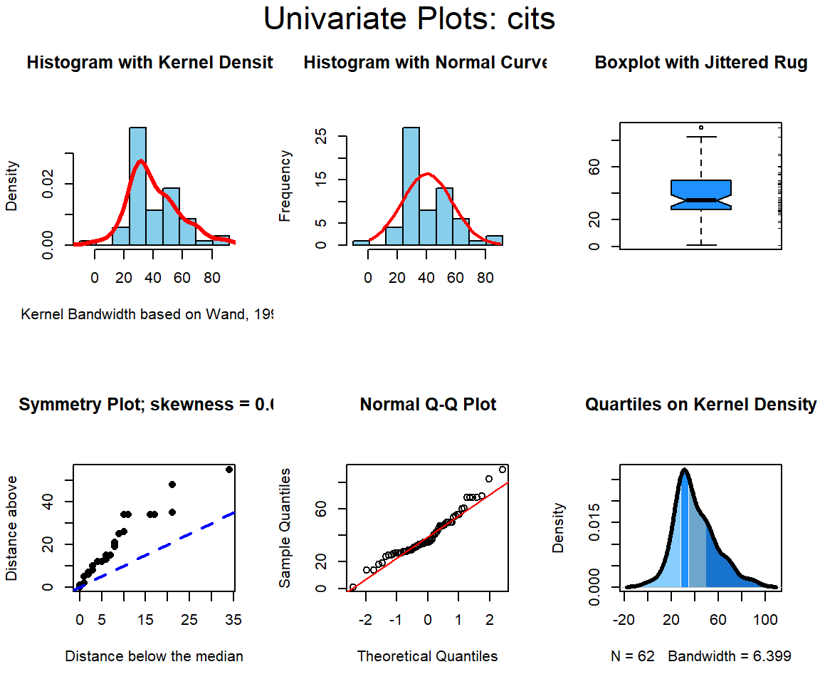
##    vars  n  mean    sd median trimmed   mad min max range skew kurtosis   se
## X1    1 62 40.23 17.17     35   39.08 14.08   1  90    89 0.68     0.57 2.18
If you don’t want to use the ‘explore’ function from ‘bcdstats’, then you can still easily obtain numerical summaries with the ‘describe’ function from the ‘psych’ package as we have done in prior work, and perhaps just go with the earlier graphs instead of the six panel figure from explore.
# our three variables are the third through fifth in the data frame
psych::describe(cohen1[,c("salary","pubs","cits")], skew=T, type=2)
## vars n mean sd median trimmed mad min max range skew
## salary 1 62 54815.76 9706.02 53681 54226.10 9119.47 37939 83503 45564 0.64
## pubs 2 62 18.18 14.00 13 16.28 10.38 1 69 68 1.38
## cits 3 62 40.23 17.17 35 39.08 14.08 1 90 89 0.68
## kurtosis se
## salary 0.50 1232.67
## pubs 2.01 1.78
## cits 0.57 2.182.2.2 Summary of Univariate EDA
All three variables have some degree of positive skewness, pubs more than cits and salary. This may mean that the residual normality assumption for the linear models is not satisfied. We will look carefully at that assumption following those analyses.
2.3 Bivariate Relationships among the three variables
The most important starting point for evaluation of a linear models regression system is visualization of the zero-order bivariate relationships. We do this with scatter plots. The two sections here do this either with base system graphics or ggplot2 in a more sophisticated and perhaps more publication ready format.
Readers are reminded that we earlier examined numerous ways of drawing bivariate scatter plots with R. This was done in the R implementation section when we considered simple regression. It included a base system graphics approach to what I thought might be a publication quality figure. In the present document, I present simple approaches to obtaining maximum information in an exploratory data analysis (EDA) type of approach where speed is important and the investigator is at initial stages of analysis.
2.3.1 Bivariate Scatterplots and SPLOM with base system functions
Initially, we can draw bivariate scatter plots for all three pairs of variables. Using base system graphics, I have done this in a more complicated fashion by adding boxplots to the margins for each variable
par(fig=c(0,0.8,0,0.8))
plot(cits, salary,  xlab="Citations", ylab="Salary")
abline(lm(salary~cits), col="red") # regression line (y~x)
par(fig=c(0,0.8,0.55,1), new=TRUE)
boxplot(cits, horizontal=TRUE, axes=FALSE)
par(fig=c(0.65,1,0,0.8),new=TRUE)
boxplot(salary,axes=FALSE)
mtext("Scatterplot & Linear Regression\n Plus Univariate Boxplots", side=3, outer=TRUE, line=-3)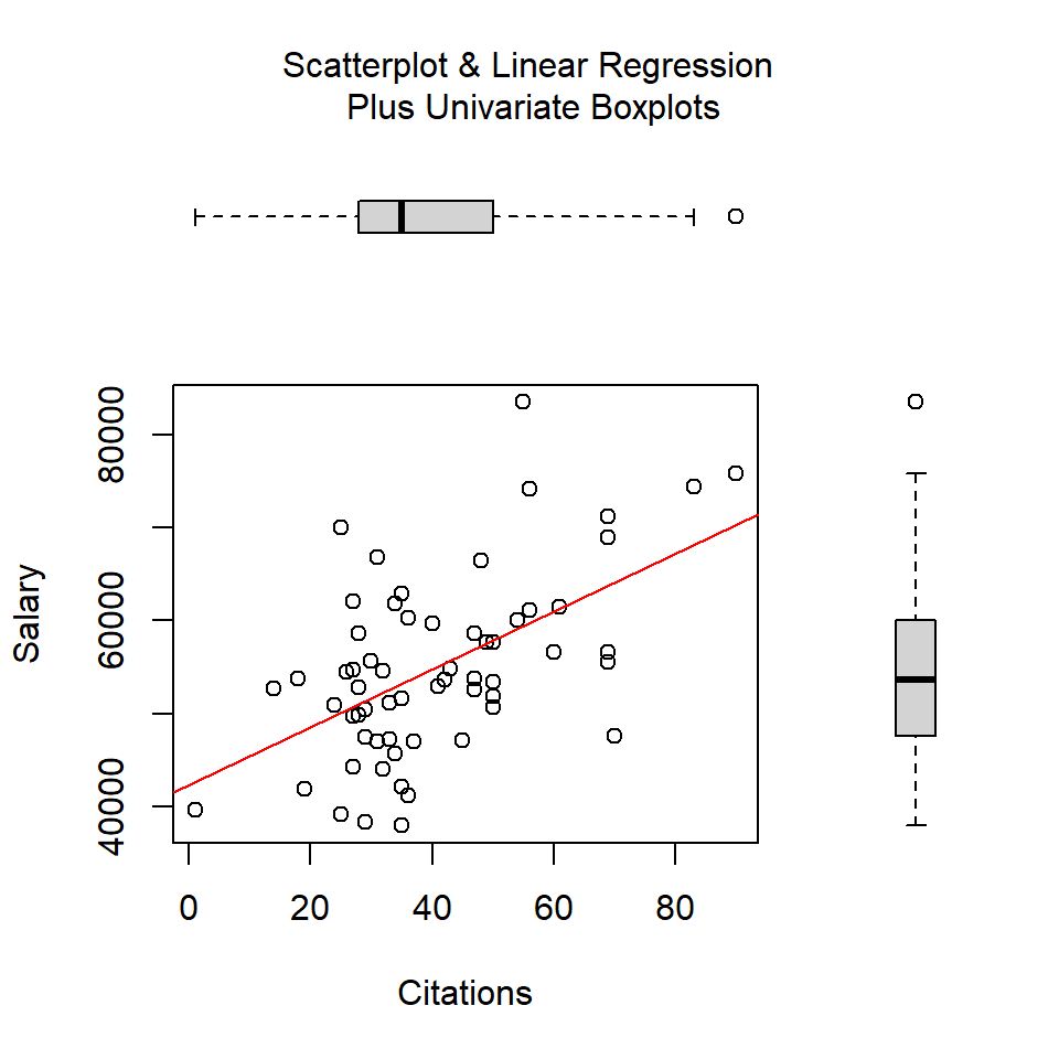
par(fig=c(0,0.8,0,0.8))
plot(pubs, salary,  xlab="Publications",
  ylab="Salary")
abline(lm(salary~pubs), col="red") # regression line (y~x)
par(fig=c(0,0.8,0.55,1), new=TRUE)
boxplot(pubs, horizontal=TRUE, axes=FALSE)
par(fig=c(0.65,1,0,0.8),new=TRUE)
boxplot(salary,axes=FALSE)
mtext("Scatterplot & Linear Regression Plus Univariate Boxplots", side=3, outer=TRUE, line=-3)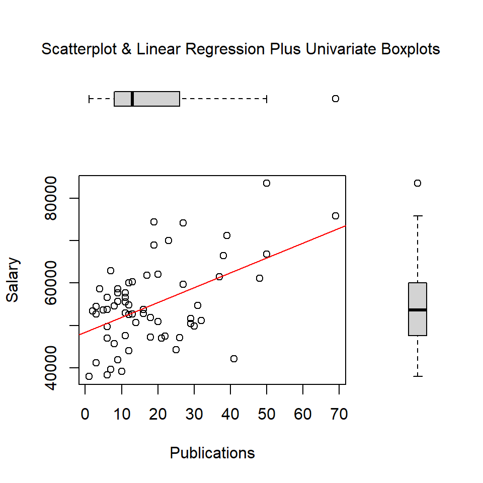
par(fig=c(0,0.8,0,0.8))
plot(pubs, cits,  xlab="Publications",
  ylab="Citations")
abline(lm(cits~pubs), col="red") # regression line (y~x)
par(fig=c(0,0.8,0.55,1), new=TRUE)
boxplot(pubs, horizontal=TRUE, axes=FALSE)
par(fig=c(0.65,1,0,0.8),new=TRUE)
boxplot(cits,axes=FALSE)
mtext("Scatterplot & Linear Regression Plus Univariate Boxplots", side=3, outer=TRUE, line=-3)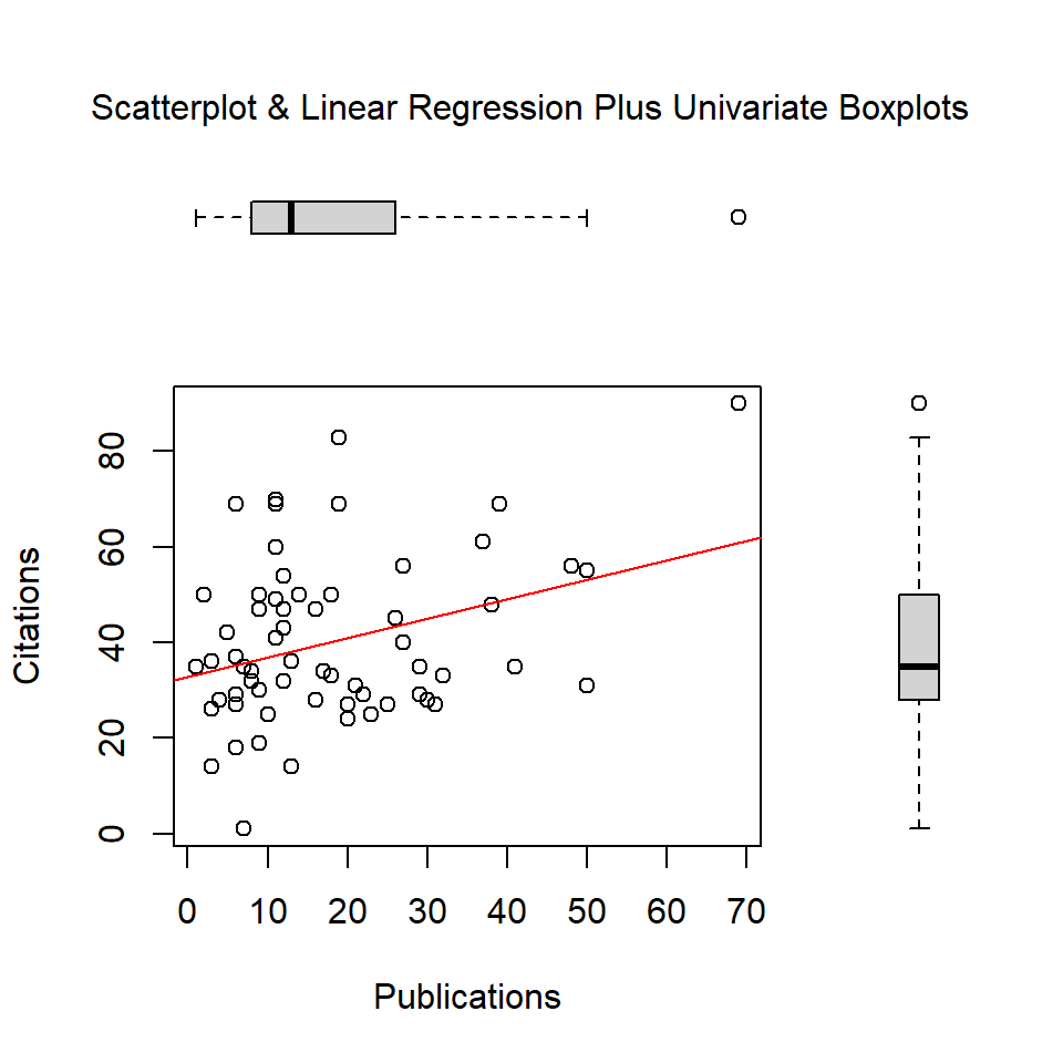
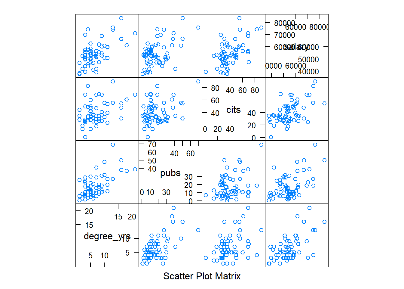
A preferred approach for the generation of bivariate scatter plots is creation of a scatter plot matrix (SPLOM). There are many ways of doing this in R. Here I use the pairs.panels function. I also permitted the ‘pairs.panels’ function from the psych package to include the time variable so that a sense of how it handles larger numbers of variables. Note the “subsetting” syntax for asking to leave out the first and sixth variables from the data frame (case number and gender)
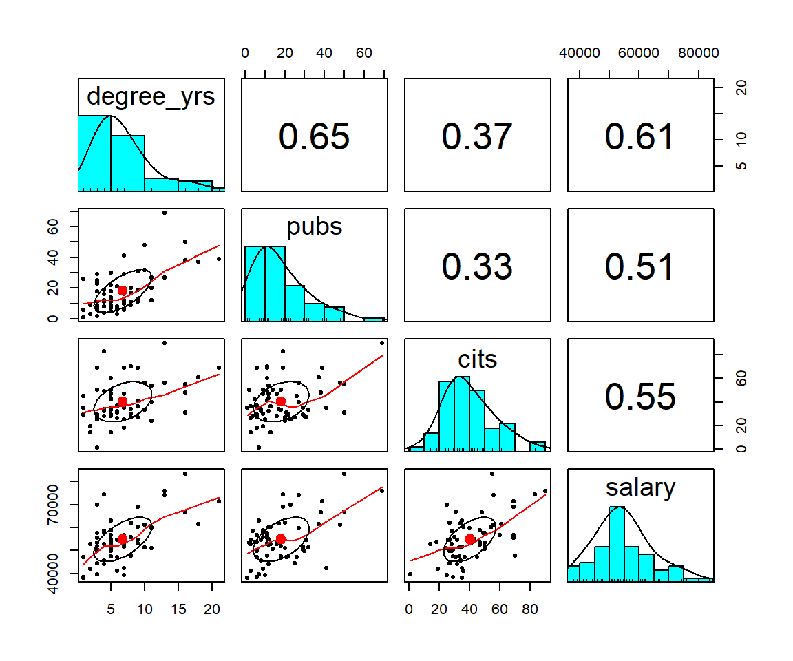
The pairs.panels function creates a SPLOM with quite a few attributes beyond the simple bivariate scatter plots. The frequency histograms and kernel density functions as well as the display of the Pearson product-moment zero-order correlation is obvious. However, the added elements on the scatter plots require explanation. Rather than plotting a linear regression function, by default, pairs.panels draws a loess fit line. The ellipse that is drawn is based on the ‘ellipse’ function from John Fox’s ‘car’ package and is implemented by default in pairs.panels. It is called a correlation ellipse and gives a sense of the correlation at limits of one std deviation above and below the mean for each variable. Each of these latter two graph elements can be controlled with arguments passed to ‘pairs.panels’. For example, instead of a loess fit, a linear regression line can be chosen. See the help for pairs.panels for more information (?pairs.panels)
2.3.2 Bivariate Scatterplots and SPLOM with ‘ggplot2’ and ‘lattice’
As a reminder of basic work we did with the introduction to using R for simple regression, bivariate scatter plots are drawn here with the ggplot function fromg the **gplot2* package. This set of plots is intended to give a sense of different kinds of information display that is possible. The plots are not refined to a publication quality level, and I only take space for the salary-pubs pair of variables. The reader can extend beyond this basic set with only salary and pubs by changing the variables
# the base plot:
#create base graph entity wthout displaying anything
pbase <- ggplot(cohen1, aes(x=pubs,y=salary))
#display the scatterplot with the data points
pbase + geom_point() 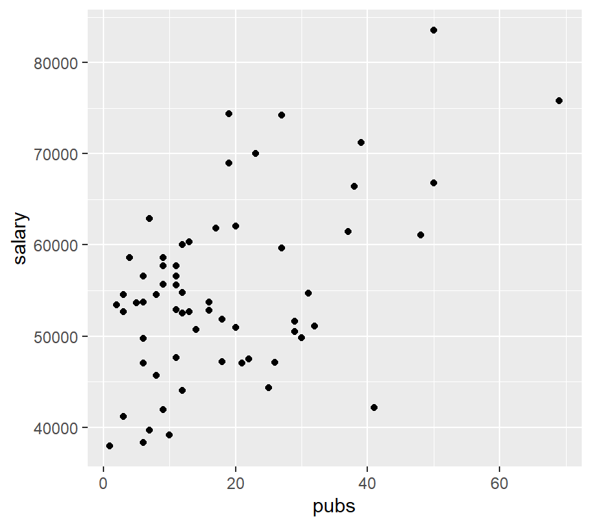
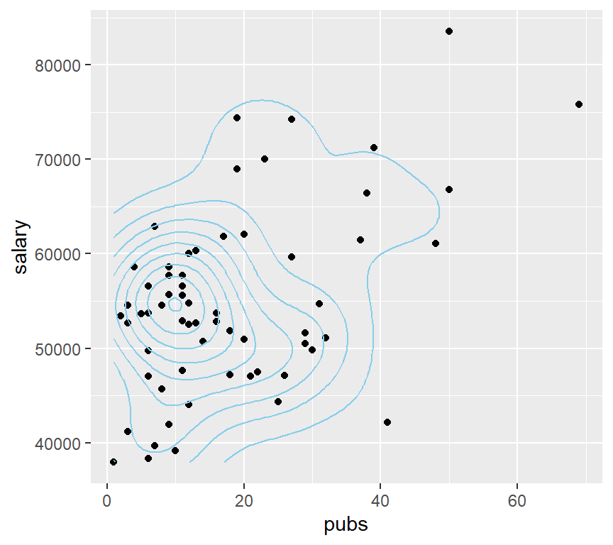
# or map the height of the density curve to a color progression using the "level" specification
pbase + stat_density2d(aes(fill=..density..), geom="raster",contour=FALSE)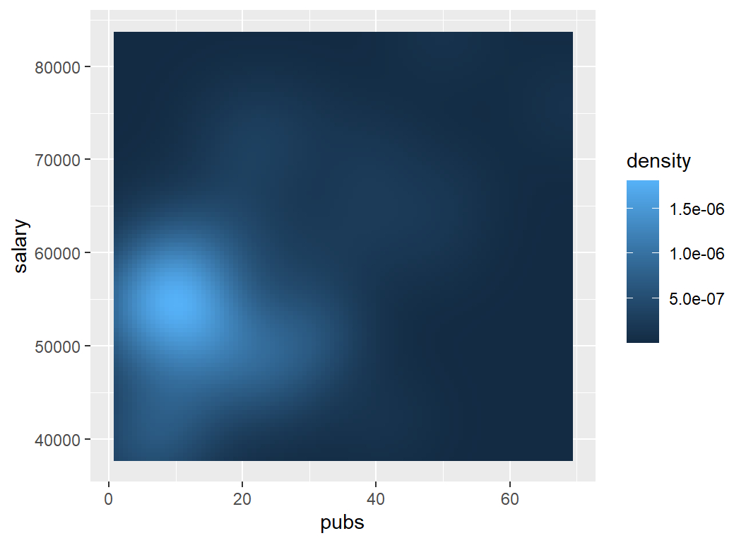
# or, do it with points and map density a different way
pbase + geom_point() +
  stat_density2d(aes(alpha=..density..), geom="tile",contour=FALSE)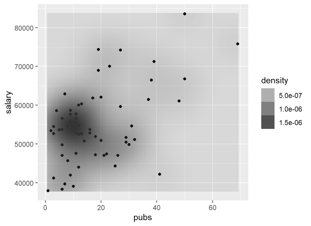
Two more ways to obtain a SPLOM are illustrated below. First, we can use the splom function from the lattice package. Note the exact specification required for requesting the subset of variables from the cohen data frame, and the tilda model symbol used to specify that data frame, and the subsetting to request the same four variables as above.
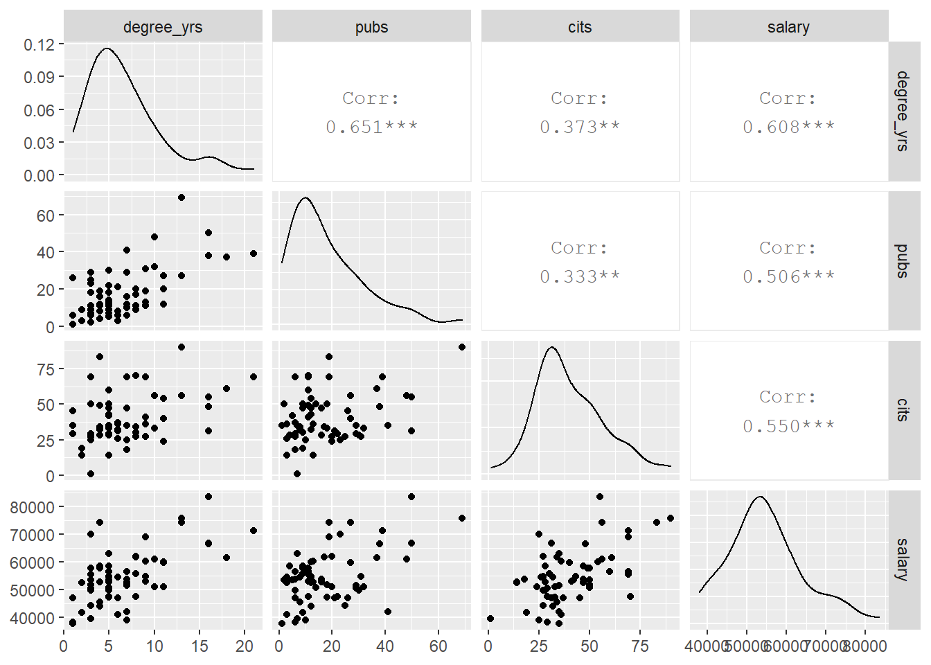
I have never found that splom function to yield a useful or appealing figure. An alternative, and easily implemented, function in the GGally package is called ggpairs. It is based on ggplot2 and is both efficient and helpful (but I probably still prefer ‘pairs.panels’)
 Each of these SPLOMS can be modified/extended to provide more useful information and to tailor the appearance.
2.4 Summary of EDA
The EDA approaches outlined above are views as an essential starting point to any more advanced modeling and inference. “Get to Know Your Data!” It is particularly important to be aware of univariate or bivariate outliers and non-normal distributions of variables. These issues can have major impacts on the ability of the linear modeling results to be accurate, generalizable, and useful. Our three primary variables (salary, pubs and cits) all appeared to have some degree of positive skewness, with pubs having the most. Pubs has an outlier that contributes to this skewness. It will be interesting to examine the residuals-based assumptions for our linear modeling when we know that non-normality in a univariate sense is present. The bivariate EDA approaches did not give any strong sense of multi-dimensional outliers, so this data set set may not have any particularly influential individual cases.